• Work
  • Journal
  • Info

Evan DiLeo

  • Work
  • Journal
  • Info

Ignasi Monreal

DiaryArticleDouble_IgnasiMeetsGucci-04_001_Default.jpg

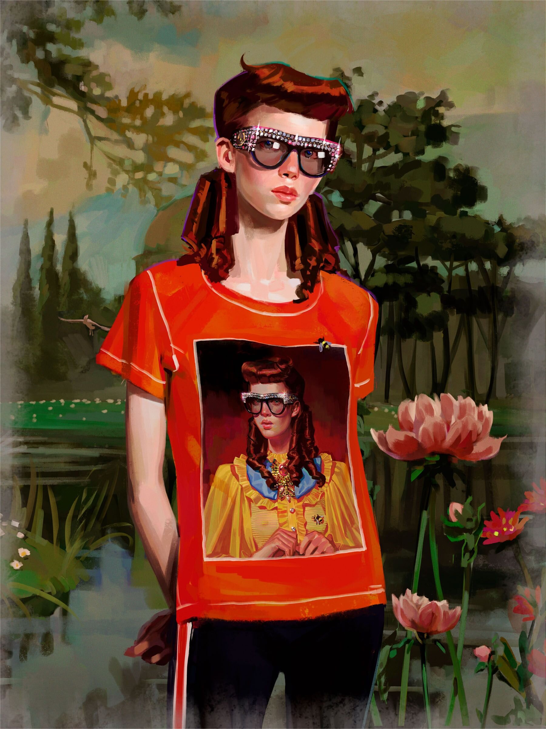
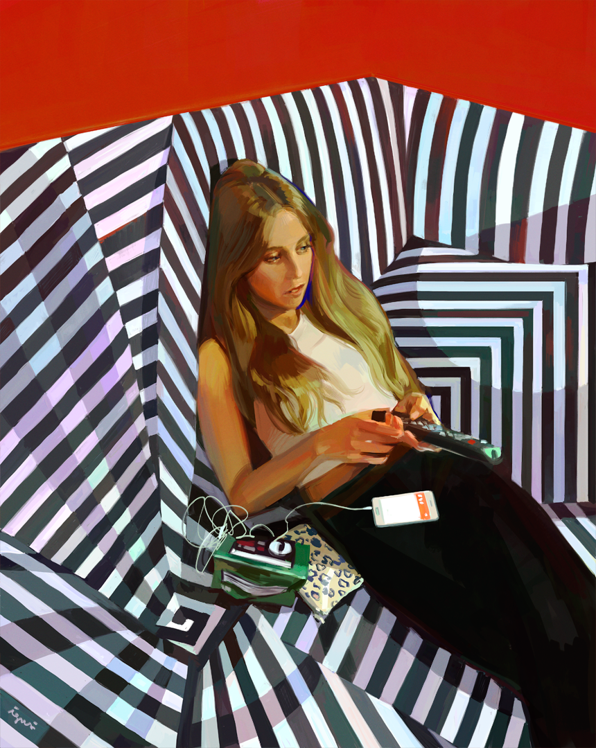
Ignasi Monreal is a Spanish illustrator based in Lisbon, who paints some really inventive and fantastical images that incorporate classic themes and mythology with modern fashion and personal observation.

it seems to be he’s thinking through concepts of beauty and absurdity mostly, recalling Hieronymus Bosch (15th century) or finding the divine (perhaps timeless) beauty in some modern person passed out on a couch, or checking her makeup on public transit. These small moments are elevated and shown in a format we associate with classical painting typically reserved for Gods or Cathedrals. And in a way allows us to imagine that maybe Michelangelo, in painting Gods and Angels and epic scenes, was probably also incorporating current things around himself that he found beautiful or sexy. Bringing this very human touch to the divine world.

Gucci Halucination - Production Company: The Line.

Meets Gucci

Additional interview with It’s Nice That

 
View fullsize 58cd998f133679b73a32992ca3ed741e.jpg
View fullsize gucci_d067b2b3-64cc-4801-9019-b70e05fdfbbf_rw_1920.jpg
View fullsize gucci_jo-gucci-2018-spring-summer-campaign-ignasi-monreal-1.jpg
View fullsize GUCCI-INSTAGRAM-ARTIST.jpg
View fullsize Portrait_Igor---Mica.png
View fullsize Portrait_IMG_0212.png
View fullsize Portrait_James.png
View fullsize Portrait_Johannes_2.png
View fullsize Portrait_La-naker.png
View fullsize Still_IMG_0064.png
View fullsize still_IMG_0081.png
View fullsize still_tesco-tulip.png
tags: illustration, painting
categories: inspiration
Tuesday 02.09.21
Posted by Evan diLeo
 

Ahmed Aldoori – Dune V Lawrence of Arabia

Ahmed Aldoori recently put out a reaction and artist critique video of the recent Dune trailer from Denis Villeneuve. I thought the trailer looked interesting, I hadn’t seen any visuals from this new film yet and I have really loved Villeneuve’s work in the past.

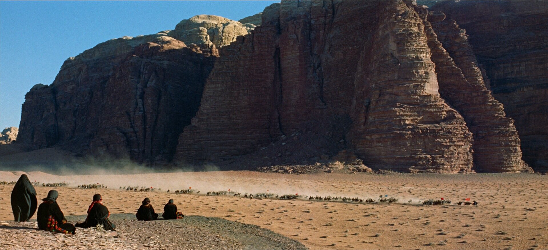
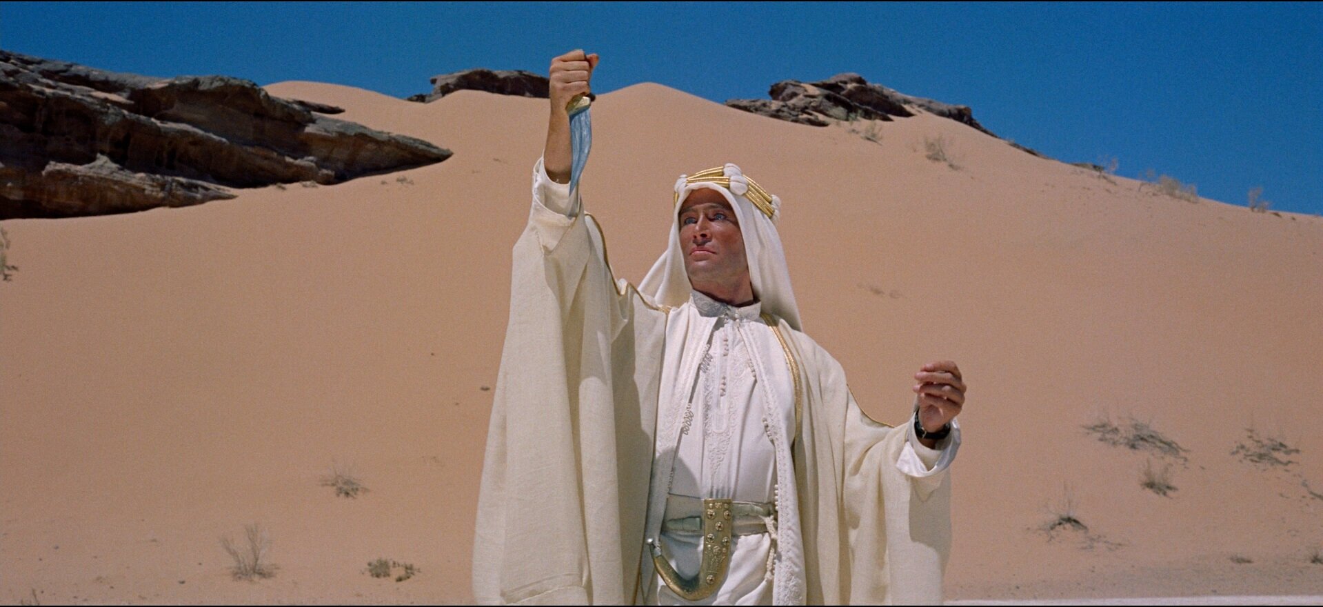
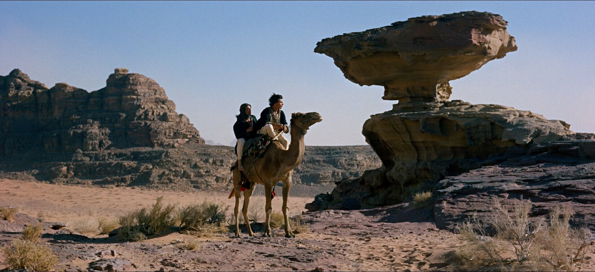
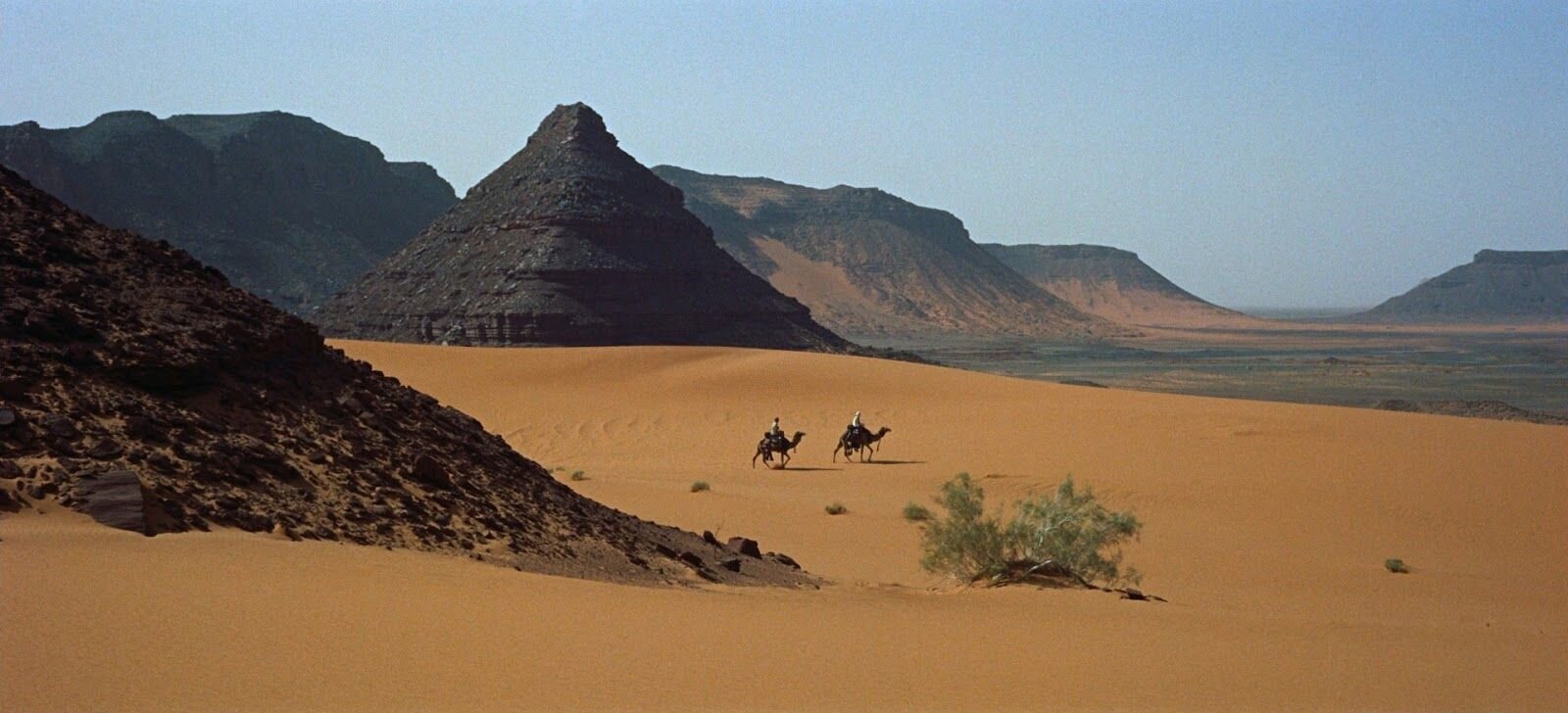
Mr Aldoori had some criticisms, specifically about the use of color in the film grade. He brings up the point that overall the feeling is grey and muted down. And that while this is supposed to be a stark dry desert planet, that doesn’t necessarily mean ‘colorless’. As a counterpoint he shows many examples from the 1962 masterpiece, Lawrence of Arabia. Also in the desert, also stark, also dry. But because of the film stock, and the realities of a real desert location. Colors lighting that could be easily missed by a very green screen-heavy, matte-painted, digital filmmaking process.

He also takes issue with the reluctance current digital filmmakers tend to have at avoiding black and silhouettes. People shoot raw, they have details in the shadows, and theres a tendency to want to keep that information because its there. And also people all down the line from directors and DP’s to post production artists are more used to seeing this footage where even in the blacks, there is detail. And that affects the final grade.

Ahmed talks about blacks, and their use in a composition to lead the eye. As a way of making a photograph bold and graphic.

Lawrence-of-Arabia-04.jpg
Lawrence-screenshot-0125034-i.jpg
7a7d02281306e39623924e2f869dba33.jpg
55dd9d84509dca7905195f3a42909a96.jpg
JbiOHwo.jpg
tags: film, painting, color, director, live action
categories: inspiration
Thursday 10.15.20
Posted by Evan diLeo
 

RIP Ron Cobb

Ron Cobb, American/Australian illustrator designer and concept artist died on the September 21, in his 80s.

Ron was know most for his work on the ships and logos and iconography in Ridley Scott’s 1979 film Alien. He also worked on Back the the Future, Total Recall, The Abyss, Dark Star, Star Wars…

More information on his life and history here at We Are The Mutants.

View fullsize Photo Sep 21, 9 48 24 PM.jpg
View fullsize Photo Sep 21, 9 49 00 PM.jpg
View fullsize Photo Sep 21, 9 49 50 PM.jpg
View fullsize Photo Sep 21, 9 51 07 PM.jpg
View fullsize 1ebbccc88469eeea5313b01cadf59d04.jpg
View fullsize SpaceTrucker_bd0bba11ac224ab8526b82f94358551f.jpg
View fullsize 9436f2e1d749c7460bf6b1e9cee2727f.jpg
View fullsize SpaceTrucker-47d43ff7eab49b2abc2666d5ac50add0.jpg
View fullsize C3azek5WIAAIyIw.jpg
View fullsize Photo Sep 22, 11 16 10 AM.png
View fullsize Photo Sep 22, 11 18 43 AM.jpg
View fullsize Photo Sep 22, 11 16 28 AM.png

The Semiotic Standard

Alien is one of the best lived-in-future worlds in all of cinema. It is dingy and rough, old and broken down. Tactile and utilitarian. In addition to the objects and interiors, there is also a very plausible graphic system for the ship indicating various safety warning. These types of symbols exist in a lot of hazardous workplaces and this version looks clean and futuristic, but also looks like it could have been in use at any point from the 40’s onward. They are completely usable and believable.

Ron_Cobb_Semiotic_Standard
Ron_Cobb_Logos_Sketch

Political Comics

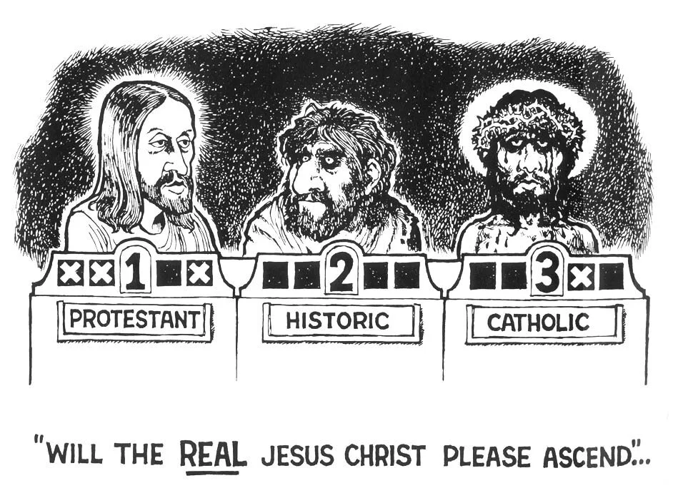
Cobb served in the Vietnam war and when he returned he got back to work as an artist, creating many gorgeous and brutal political cartoons for the Los Angeles Free Press. They are critical of the government handling poverty, race, the draft, nukes, environmentalism and police brutality. These comics are an amazing time capsule of the anti-war and politically conscious era and are incredibly relevant today. Sadly we haven’t solved really any of these problems.

View fullsize blog-cobb-3.jpg
View fullsize 7747614_orig.jpg
View fullsize 8291262e3ec7ec2ae48f58d959d744fb.jpg
View fullsize Photo Sep 21, 9 26 22 PM.jpg
View fullsize ron_cobb_cartoon_we_are_the_mutants_11.jpg
View fullsize viet-justvisiting-blog-rcobbjustvisiting.jpg
View fullsize Photo Sep 21, 10 49 59 PM.jpg
View fullsize viet-econ-unnamed (3).jpg
View fullsize indians-blog-cobb-alien (1).jpg
View fullsize BangBang_Suicide-cf41e30ec1583dee7fa409ecc7f98abd.jpg
View fullsize cobb_jesus.jpg
View fullsize Consumer-dcbf28a0058c67a3ccca8523294e37c9 (1).jpg
tags: film, conceptart, graphic design, politics, comics, war
categories: inspiration
Wednesday 09.23.20
Posted by Evan diLeo
 

Sundance 2020 Identity – Studio Lowrie

s2020_bug.png

For 2020, the Sundance Film Festival employed Studio Lowrie to rebrand with these striking and op-art glyphs and typography based branding. Its simple and powerful, and stands out amid the visual noise of Park City during the festvial. As a system it uses a pared down color pallate and is meant to function across a variety of media and applications, and both static and in motion. It also takes cues from four musical pilars: Jazz, Rock, … Italo-Disco.

Looks almost a bit like navajo art or camera test and focus patterns. The Studio themselves mentions the circular shape is referential of film projectors, eyes dilating or contracting, and the sun.

Branding from Studio Lowrie

Typeface La Nord by Raoul Gottschling

Motion by Connor Campbell

More on It’s Nice That.

Sundance Motion Reel – Connor Campbell

tags: graphic design, film, branding
categories: inspiration
Monday 09.14.20
Posted by Evan diLeo
 

Lord of the Rings – Cor Blok

Cor Blok is a Dutch illustrator who made some of the earliest visual interpretations of the Hobbit and Lord of the Rings by JRR Tolkien.

Read more

tags: books, illustration, fantasy
categories: inspiration
Friday 09.11.20
Posted by Evan diLeo
 

Lord of the Rings – Barbara Remington 1965

1A73F5FB-76A4-4024-B56C-7896F1743201-8534-000003D454828B71.jpeg

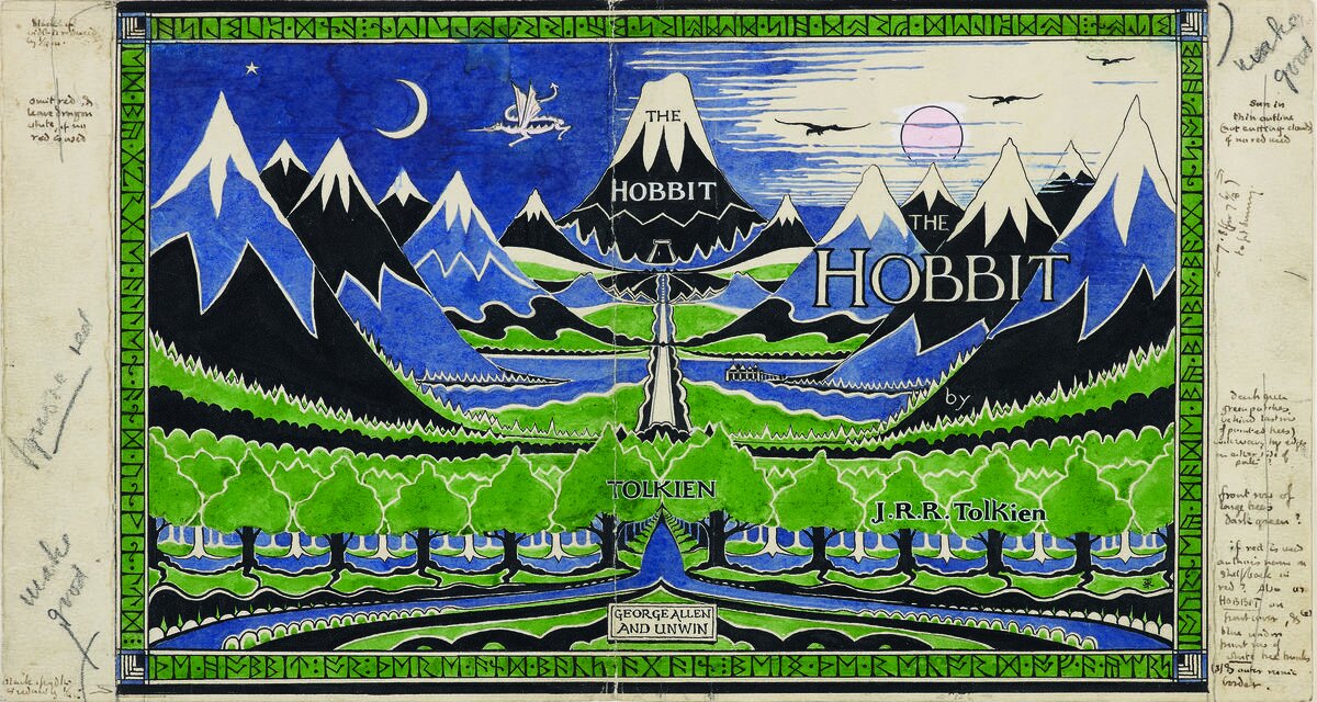
I saw a thread recently on Twitter about how bad the covers for the hobbit were from the mid 90s which lead to loads of people posting covers of LOTR and The Hobbit book art. And so I posted my own experience. The books I had read, my moms copies, were far and away some of the nicest of the lot. These felt whimsical and fun very much in line with Tolkien’s original drawing for the Hobbit and Lord of the Rings.

Barbara Remington illustrated them for the 1965 paperback editions, one of the most widely know editions to that time. She designed them all quickly, without having read the books. And I think they are just wonderful.

Though Ms. Remington regretted being unable to read “The Lord of the Rings” and “The Hobbit” before illustrating them, she was ultimately happy with the way her artwork came out.

“After reading his work, I was in awe of Tolkien,” she said. “I knew there was something special about him. If I read ‘The Lord of the Rings’ first, I don’t think I could have drawn the cover art.”

Barbara also moved to New York City in the early 60’s and was active in the Beat Movement of the time. Extended interview with her at Tolkien Collectors Guide.

Tolkien actually didnt much care for Barbaras work, not understanding what some of the animals (whats that, a lion?) and plants (are those… pumpkins?) being depicted were. And thats too bad, but she hadnt read the book, so, get over it I guess. I Love Barbara’s work, just as I love Cor Blok, who’s depictions were also called out by tolkien for not being accurate, though he did like them. People can make up whatever visuals they like that suit them. Its partly an act of creation in reading, imagining the world you hear described.

Coincidentally, the bad cover from the hobbit in the 90’s? That was the art on the version I read then as well.

Barbara Remington Obitutary — New York Times


Barbara Remington illustrated Map of Middle Earth in the same style and with many of the same elements as the 1965 paperback cover.

Barbara Remington illustrated Map of Middle Earth in the same style and with many of the same elements as the 1965 paperback cover.

Michael Herring illustrated 90s covers. The ‘bad’ covers mentioned above. Its too bad, the rendering quality is nice, they just seem a bit hokey compared to the graphic colorful 1965 version or Tolkien’s own drawings which are cute and a bit naive.

View fullsize Tolkien-Sketch-2
View fullsize artofthehobbit4.jpg
View fullsize Tolkien-Mountain-2
View fullsize Tolkien-Smaug-1
View fullsize Tolkien-Cover-1
View fullsize Barbara-Remington-LOTR-Map-Detail-1
View fullsize Barbara-Remington-LOTR-Map-Detail-2
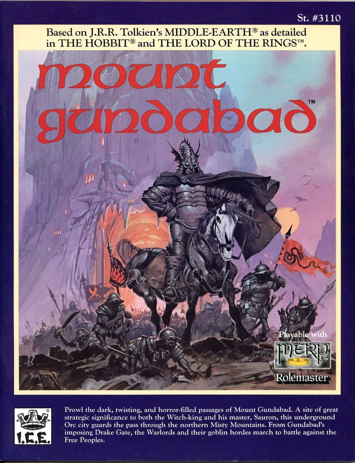
View fullsize MountGundabad_1989_RPG.jpg
View fullsize  Worm Ouroboros - A book from 1922, Barbara Remington also illustrated covers for in 1967.
View fullsize FIG_5_pg-96.jpg
View fullsize FIG_6_pg-206.jpg
View fullsize Tolkien-drawings-14.jpg
View fullsize Tolkien-HobbitHome-1.jpg
View fullsize TheHobbit-1960-Dutch.jpg
View fullsize  Looks like this might be a ref used for How to Train Your Dragon.
View fullsize Tove-Jansson-The-Hobbit-600x882.jpg


tags: illustration, books, fantasy
categories: inspiration
Wednesday 09.02.20
Posted by Evan diLeo
 

The Bus – Paul Kirchner

TheBus-PaulKrichner-01

The Bus is a wonderful surreal strip comic by Paul Kirchner.

Read more

tags: comics, inspiration, drawing
categories: inspiration
Thursday 08.27.20
Posted by Evan diLeo
 

BLM Reading List

Writer Ta-Nehesi Coates

Writer Ta-Nehesi Coates

This is a short reading list to help myself understand the history and context of racial issues in america. It’s short but I’m starting here.

Read more

tags: books, blm, black lives matter
categories: politics
Thursday 06.11.20
Posted by Evan diLeo
 

Painting Digital Raw

Melana_4_1a.jpg
Melana_4_2a.jpg

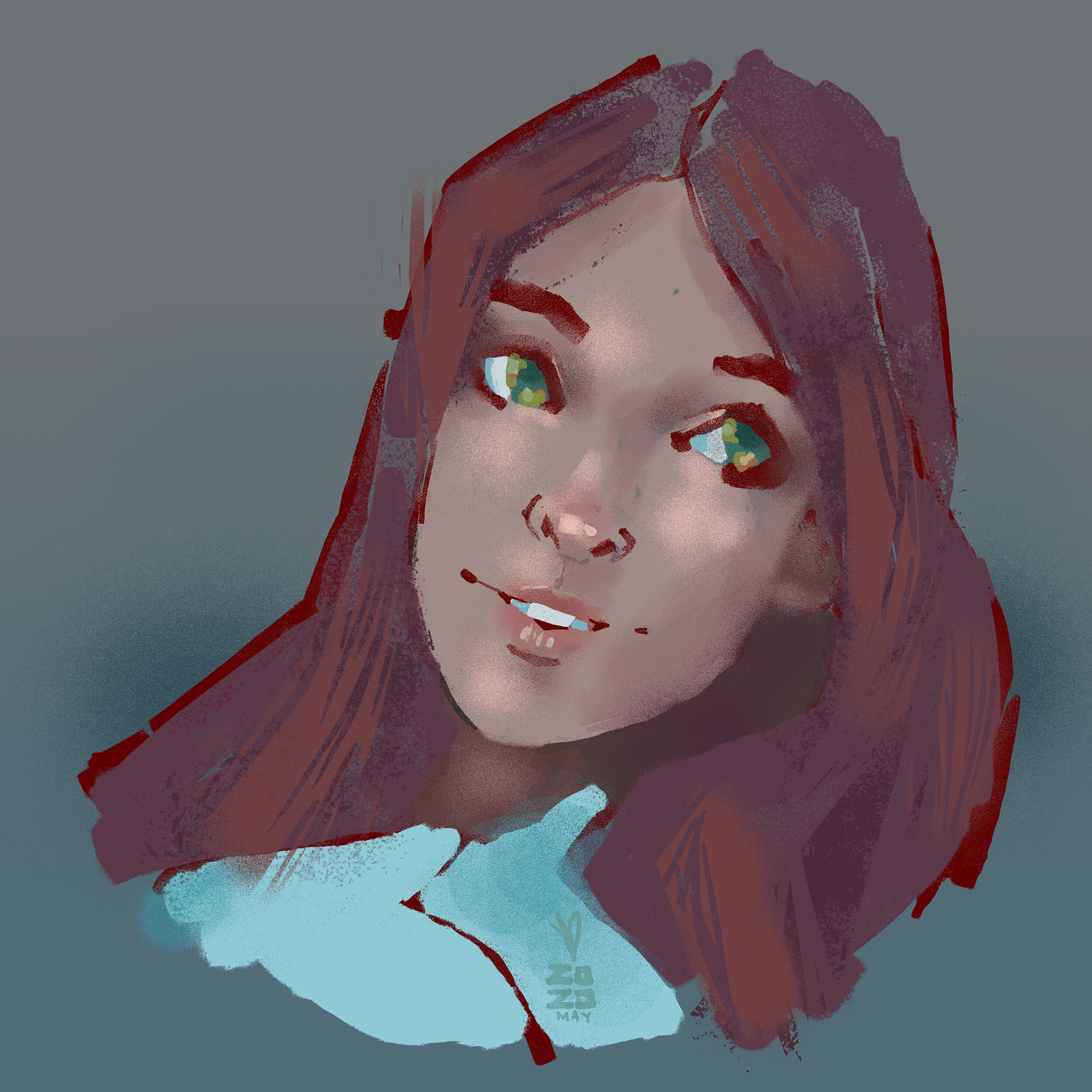
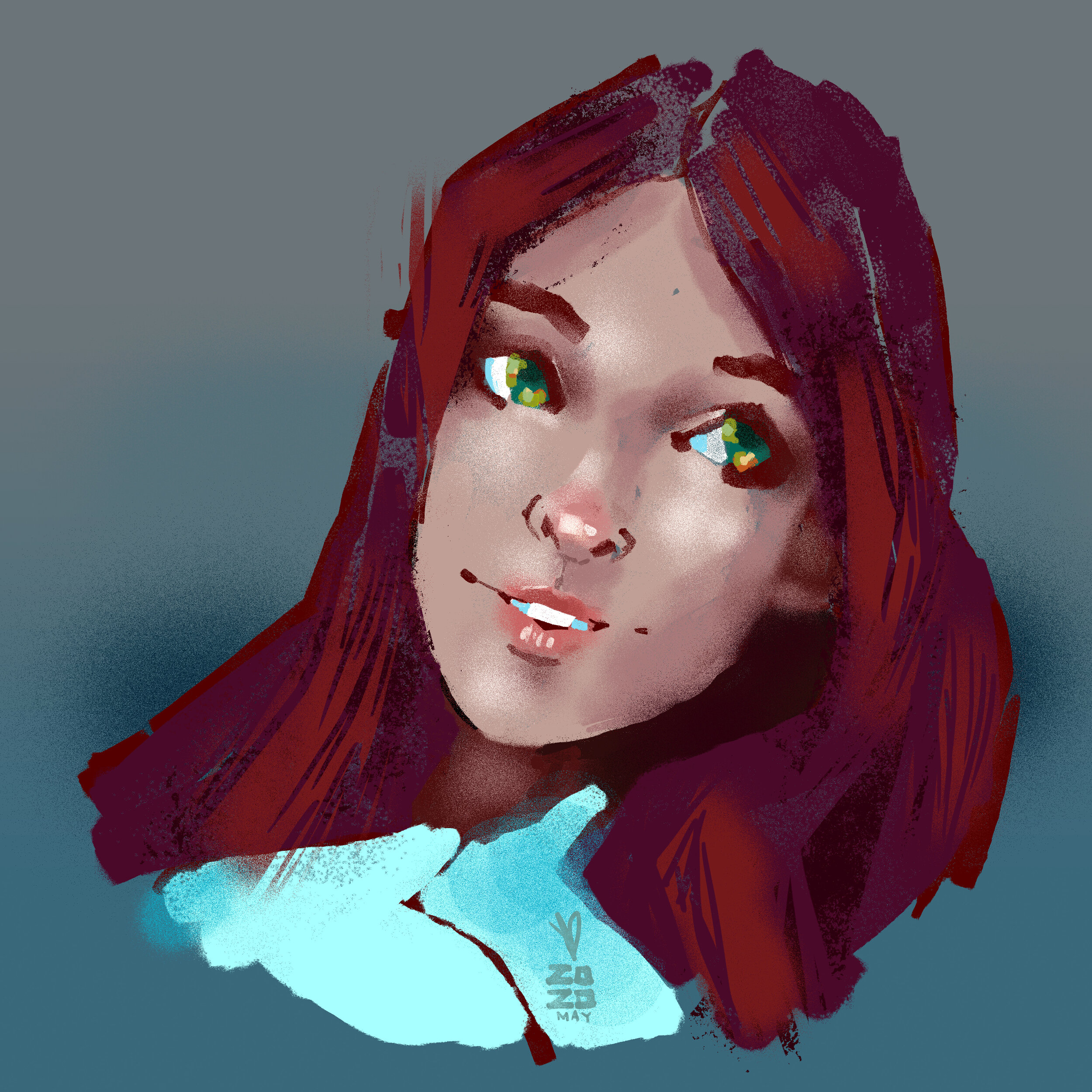
I have had a tendency in the last few years with regards to color in my digital painting and probably design work and I just had a revelation. I would paint, or grade photos a lot of the time with tuning the black point up so there is no 'true black' to the image. Also, I might do a sketch and tone the line work deep red or deep blue, and then paint over it to embed a little warmth into the image. Its a subtle thing but you make different choices with color painting over a colored sketch than a black and white one.

This all runs very contrary to the method I see from a lot of digital artists where they will sketch in black and white or grey, then do flat color selections, and do a shading render in black and white and eventually work color back into the image. I start with color and avoid being stark from the very beginning. 

Ive also borrowed a technique from illustration school with drawing over a grey or toned background. where you are then pushing  the image  more and more toward the highlights and low lights, but the initial work is very low contrast. and in a lot of case its low saturation, though there is color.

I completed a drawing this morning and i threw a levels layer over the top of it and it occurred to me that Im painting in a way that is very much like shooting 'flat' for raw post processing. Where you shoot and things are very even and greyed out almost allowing the most information in each image and therefore the most flexibilty with the color grade after. I think somehow from years shooting photos and video, and painting and staring at computer screens, I might even have built up an affinity for this low contrast look. I can boost the colors but I almost prefer then neutral toned down version.

This style of using color is also very useful in that you can paint and paint and paint all very close to your limited palette, neutrals, and then suddenly when you add a bold color or a very dark or light color you immediately have a lot of contrast that can add focus to your image.

Painting Process from Ryan Lang

Painting Process from Ryan Lang

tags: digitalart, process
categories: technical
Wednesday 05.20.20
Posted by Evan diLeo
 

Washed Out – Floating By

This video uses a fun collection of repeating animated clips, from 2D or taken from I bet keys off a greenscreen to tell us a story about daily life and the repetition therein.

-

Directed by Drew Tyndell for Washed Out

Also, watch down the Mister Mellow Show here for an awkward time via Stones Throw.

tags: music video, motion, director
categories: inspiration
Wednesday 05.06.20
Posted by Evan diLeo
 

Manly – Jesse & Justin Moynihan

Manly-Moynihan-14469752585_13af1f9155_b.jpg

Last week I was talking with some friends this week about the release of The Midnight Gospel today on Netflix (from Duncan Trussell, Comic and Psychedelic Wanderer and Pendleton Ward, Creator of Adventure Time) and I wanted to show them this epic little short I found years ago. I struggled to remember the name of this cartoon, googling wildly:

PSYCHEDELIC CARTOON SHAPES PYRAMID LAZER VIOLENCE FIGHT TESSERACT

…to no avail But since I did finally find it I’ll share it here.

It’s another cartoon related in tone and content to Adventure Time from Jesse and Justin Moynihan, which is no surprise as Jesse worked as a storyboard artist on Adventure Time.

The writing is silly and broad. It’s awkward bro-speak thats good for a laugh. Almost written as if a child did a take on sci-fi fantasy stuff and just didn’t know about or bother with appropriating the typical science jargon. Its endearing like that. Feels very related to Adventure time though its a little more violent and grown up. A good stoner psychedelic carton

‘Why you being all mystery-ish?’

tags: cartoon, scifi, illustration, psychedellic, funny
categories: inspiration
Monday 04.20.20
Posted by Evan diLeo
 

George Condo on Drawing

George Condo is an American painter and artist. He lives in New York.

He talks about Picasso and early 20th century artists rebelling against his classical training… for Condo painting in the 80’s it was all about rebelling against abstraction. Back to figurative image making.

tags: artist, drawing, painting, process
categories: inspiration
Wednesday 03.18.20
Posted by Evan diLeo
 

Covid-19 Cheat Sheet

covid19_edileo_Mark.png

A list of resources and reading relating to Covid-19, how it spreads, how it works, what to be mindful about

Read more

tags: covid, health
categories: selfcare
Tuesday 03.10.20
Posted by Evan diLeo
 

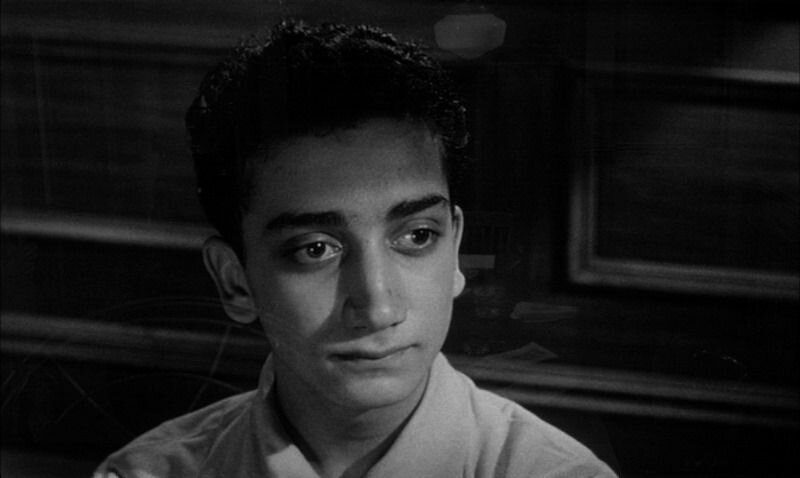
Lumet – 12 Angry Men

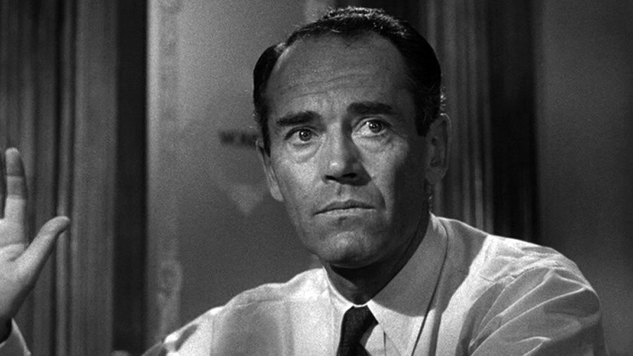
8_fonda_fg_large.jpg

12 Angry Men – 1957 Sidney Lumet

Angry, yes I suppose. And also very sweaty.

It’s amazing that this whole film is just one room and so engaging. Shooting dialogue for 90 minutes, and varying angle and light and distance for tone all worked so well. 

It’s incredibly well shot actually. I thought at first that the close ups on the dissenter (Juror 8) were a lot like romantic portrait lighting, with a soft irised-down keylight and that this was supposed to be meaningful, for only him. But other characters each later get this treatment as well. That’s just how they liked to light the close ups I guess.

I was expecting, in part from this light, that there would be a turn where it was revealed he had some malicious intention, like a Keyser Söze moment. Or maybe he were somehow friends with the accused or from the same slum or was somehow otherwise meddling with the trial. I was suspicious for a good portion of this film. There is also an early shot after he reveals he has doubts, in which there is a strange turn in the music from happy and chirpy to a sinister final few bars as we dolly in on him. I thought they were showing their cards here.

'I know their type, he’s one of them’

'I know their type, he’s one of them’

I thought the point of the story might be to show how easily people can be swayed for good or ill, persuaded by someone’s slick talking. Especially in our current age of subjective truth and a misinformed public and the propaganda machine which is Fox News and AM Radio that is constantly working to undermine the idea of truth.

But the story is rather about first how people can be persuaded sure (maybe I was half right), but also how even when things seem clear cut, with deeper examination they may not be. And that our personal internal prejudices do more to affect our opinions than we realize. Lumet himself explains it that the dissenter is the hero, he is the voice of reason. This I missed until much later when it becomes obvious that the hard guilty plea people have deeper prejudices.

The story is also about race and class prejudice which makes sense for the time it were made. The assumptions you make of your neighbors who are different ‘those people’ ... ‘they don’t value human life like we do’. And sadly, these prejudices still haunt us, even if their forms may have altered slightly. We are still dealing with these misconceptions of our neighbors in America, right now.

Another very interesting technical detail on display here is the staging and camera morphing across the whole picture. That as the characters and story have arcs they follow, so too does the camera. In his book, Making Movies, Lumet describes this at play in several pictures. Using aesthetic elements to convey meaning over the course of the film.

THE LENS PLOT – From Making Movies - Chapter Five, The Camera

It never occurred to me the shooting an entire picture in one room would be a problem. In fact I felt I could turn it into an advantage. One of the most important dramatic elements for me was the sense of entrapment those men must have felt in that room. Immediately a 'lens-plot' occurred to me. As the picture unfolded, I wanted the room to seem smaller and smaller. That meant that I would slowly shift to longer lenses as the picture continued. Starting with a normal range (28mm-40mm) we progressed to 50mm, 75mm and 100mm lenses.

In addition, I shot the first third of the movie above eye level. And then, by lowering the camera, shot the second third at eye level and the last third below eye level. In that way, by the end, the ceiling began to appear. Not only were the walls closing in, the ceiling was as well. The sense of increasing claustrophobia did a lot to raise the tension of the last part of the movie.

On the final shot, an exterior that showed the jurors leaving the courtroom, I used a wide angle lens. Wider than any that had been used in the entire picture. I also raised the camera to the highest above eye-level-position. The intention was to literally give us all air, to let us finally breathe, after two increasingly confined hours.

This is a very simple idea to execute across the film and it’s affect might be hard to detect viewing casually. But surely you can feel it. This decision adds to the overall feeling in the film in ways that the acting should, the light should… but here the camera too is used to make you feel the story. It’s so smart.

His book is one of the best I’ve ever read on the technical and creative process of making a film and the decisions that go into directing. I strongly recommend it anyone interested in movies.


More:

on Charlie Rose in 1995 talking about Making Movies

Criterion Article Lumet's Faces

tags: gdfilmclub, film
categories: inspiration
Thursday 01.30.20
Posted by Evan diLeo
 
Newer / Older

© 2025 Evan DiLeo and/or respective clients.