Ahmed Aldoori recently put out a reaction and artist critique video of the recent Dune trailer from Denis Villeneuve. I thought the trailer looked interesting, I hadn’t seen any visuals from this new film yet and I have really loved Villeneuve’s work in the past.
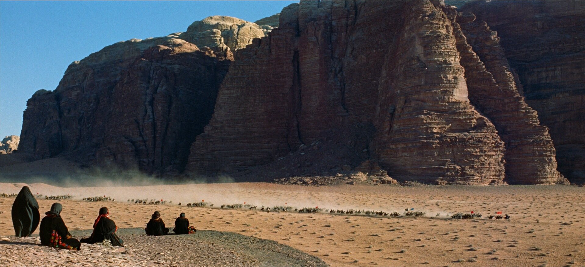
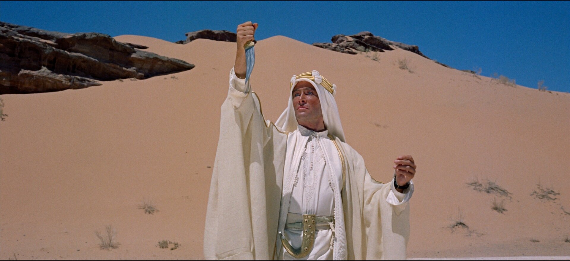
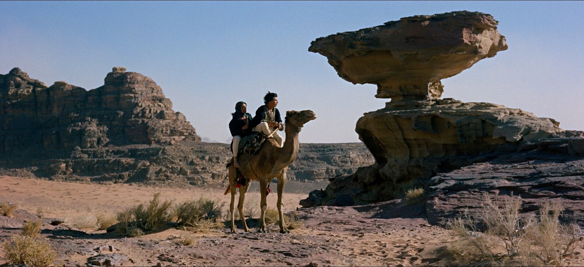
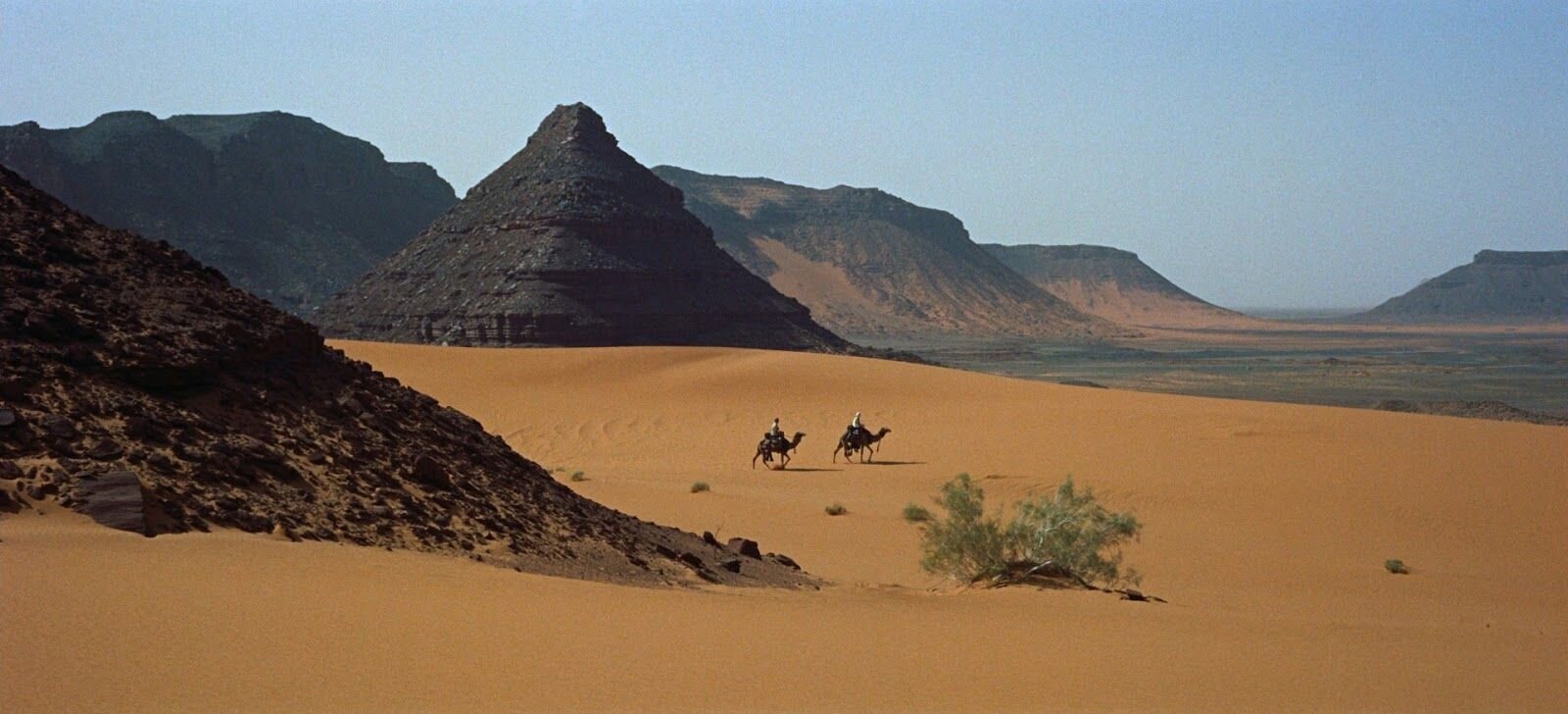
Mr Aldoori had some criticisms, specifically about the use of color in the film grade. He brings up the point that overall the feeling is grey and muted down. And that while this is supposed to be a stark dry desert planet, that doesn’t necessarily mean ‘colorless’. As a counterpoint he shows many examples from the 1962 masterpiece, Lawrence of Arabia. Also in the desert, also stark, also dry. But because of the film stock, and the realities of a real desert location. Colors lighting that could be easily missed by a very green screen-heavy, matte-painted, digital filmmaking process.
He also takes issue with the reluctance current digital filmmakers tend to have at avoiding black and silhouettes. People shoot raw, they have details in the shadows, and theres a tendency to want to keep that information because its there. And also people all down the line from directors and DP’s to post production artists are more used to seeing this footage where even in the blacks, there is detail. And that affects the final grade.
Ahmed talks about blacks, and their use in a composition to lead the eye. As a way of making a photograph bold and graphic.


