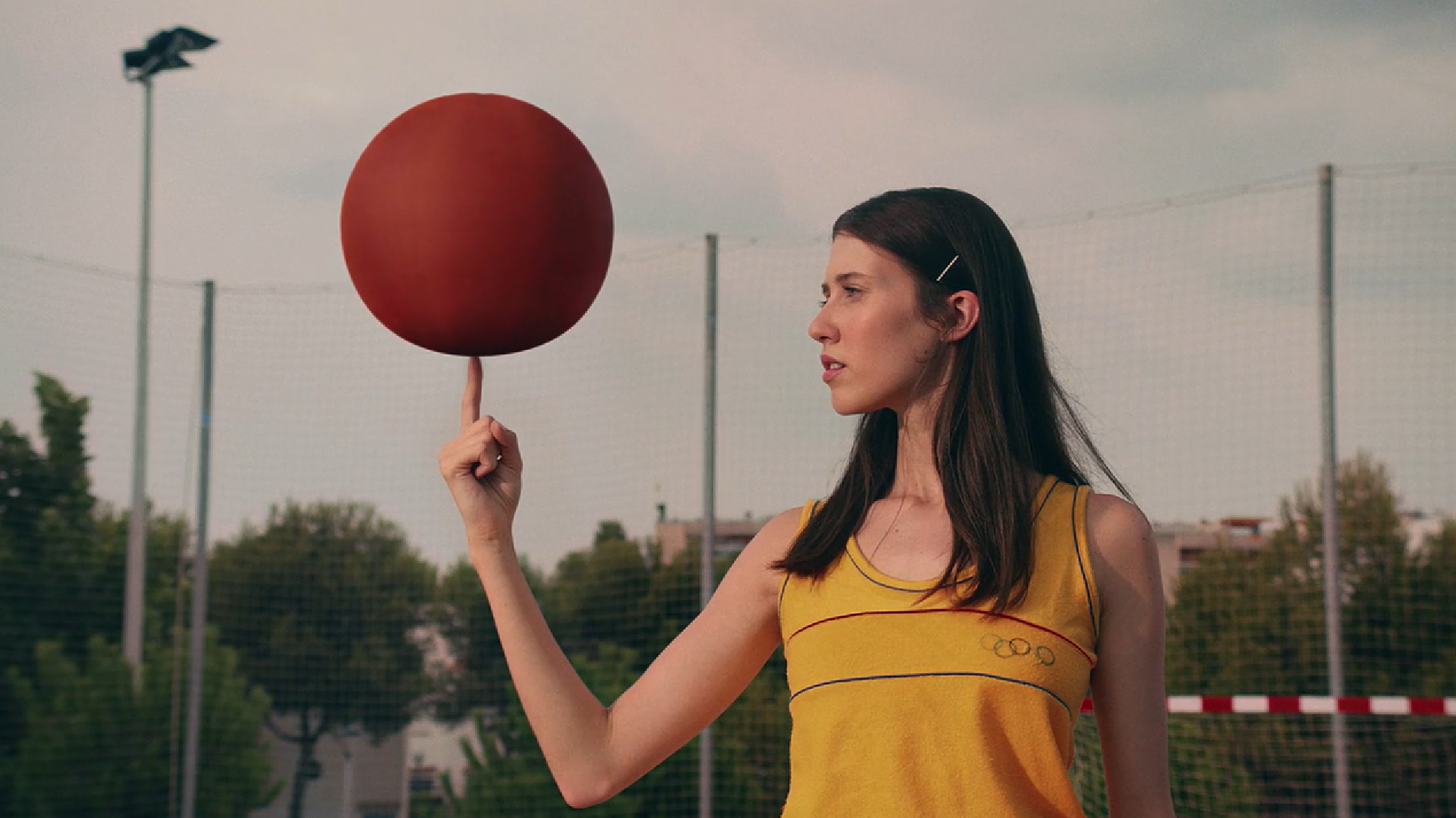
A wonderful execution of a simple premise in this music video from David Bertram
Ahmed Aldoori – Dune V Lawrence of Arabia
Ahmed Aldoori recently put out a reaction and artist critique video of the recent Dune trailer from Denis Villeneuve. I thought the trailer looked interesting, I hadn’t seen any visuals from this new film yet and I have really loved Villeneuve’s work in the past.
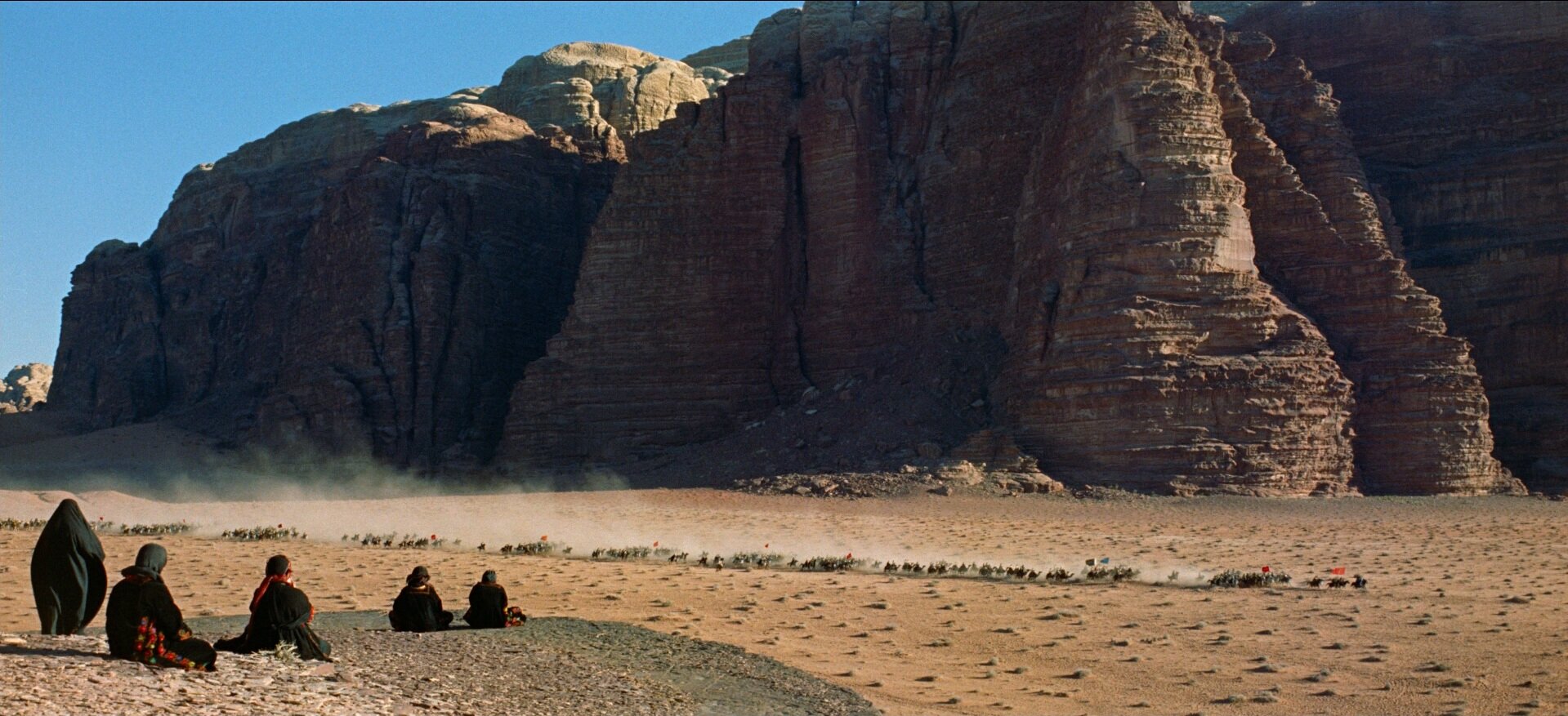
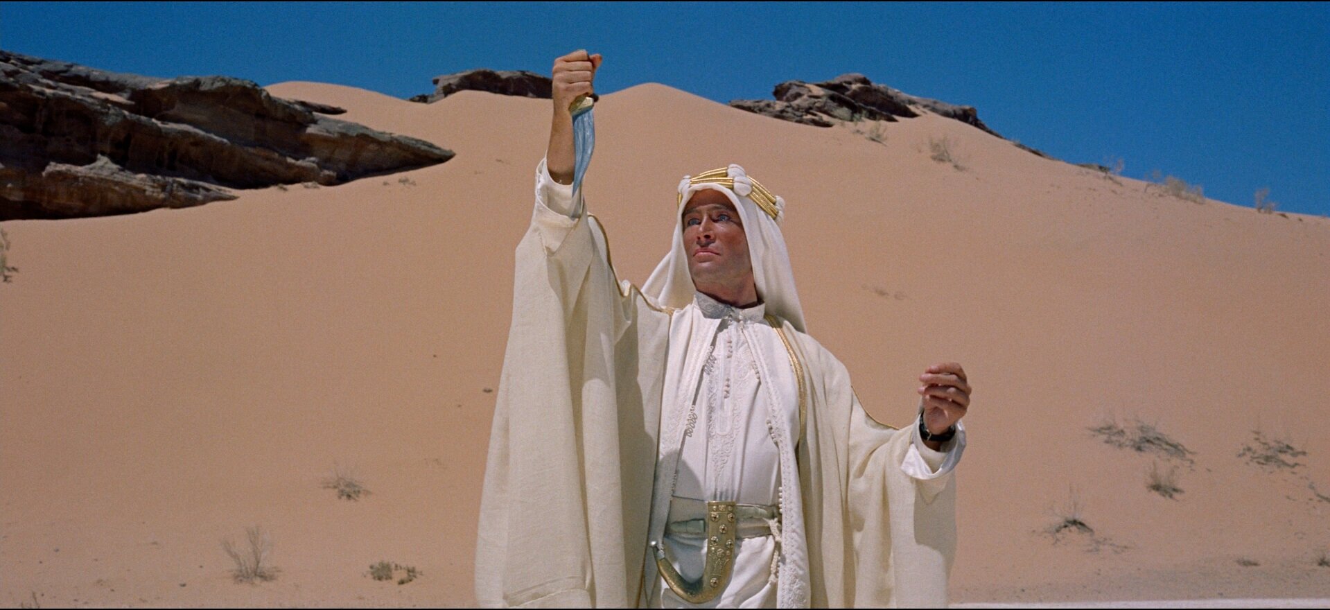
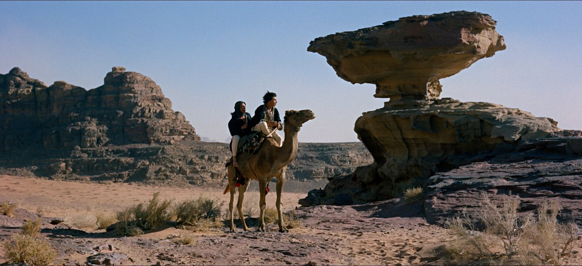
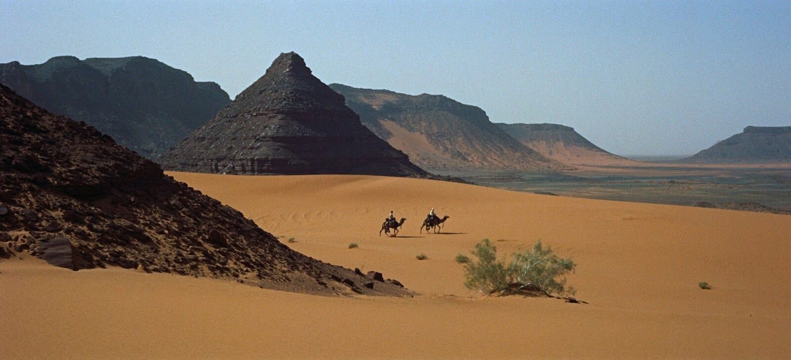
Mr Aldoori had some criticisms, specifically about the use of color in the film grade. He brings up the point that overall the feeling is grey and muted down. And that while this is supposed to be a stark dry desert planet, that doesn’t necessarily mean ‘colorless’. As a counterpoint he shows many examples from the 1962 masterpiece, Lawrence of Arabia. Also in the desert, also stark, also dry. But because of the film stock, and the realities of a real desert location. Colors lighting that could be easily missed by a very green screen-heavy, matte-painted, digital filmmaking process.
He also takes issue with the reluctance current digital filmmakers tend to have at avoiding black and silhouettes. People shoot raw, they have details in the shadows, and theres a tendency to want to keep that information because its there. And also people all down the line from directors and DP’s to post production artists are more used to seeing this footage where even in the blacks, there is detail. And that affects the final grade.
Ahmed talks about blacks, and their use in a composition to lead the eye. As a way of making a photograph bold and graphic.
Washed Out – Floating By
This video uses a fun collection of repeating animated clips, from 2D or taken from I bet keys off a greenscreen to tell us a story about daily life and the repetition therein.
-
Directed by Drew Tyndell for Washed Out
Also, watch down the Mister Mellow Show here for an awkward time via Stones Throw.
The Windshield Wiper
From Vimeo:
The Windshield Wiper is a very personal and particular vision on Love and relationships.
Written, directed and designed by Alberto Mielgo and Produced by Leo Sanchez Studio and Pinkman.tv. Running time : 15min
Key Frame Animation
albertomielgo.com
leosanchezstudio.com
pinkman.tv
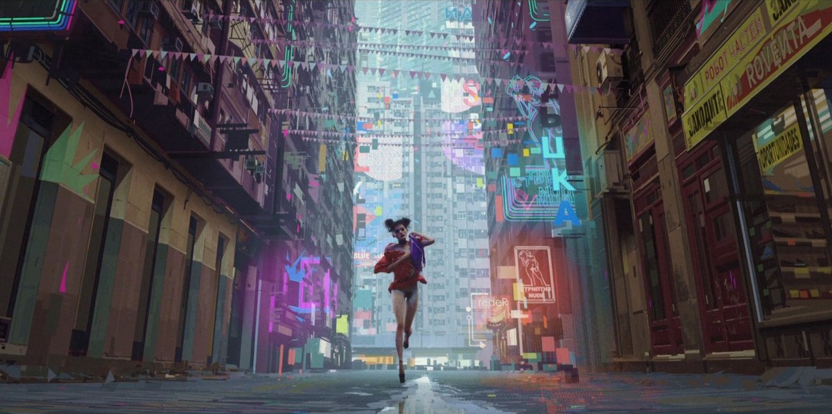
Alberto Mielgo, hot off of both Into The Spiderverse and Love Death & Robots, released this trailer last month for The Windshield Wiper.
It’s amazing to see how even as this work is so hard to pin down exactly how its made, it is expertly translated to animation. It is both technically and an creatively astounding.
Both the digital and physical paintings are wonderful and it was hard to figure how any of them were made when I first came across them. Hard to distinguish digital from real paint. The style and execution is so strong. And digitally, his was one of the first artists I saw working from a pure speed perspective, no tricky brushes, no layers, just paint… Gotta go fast.
With the animation, specifically for The Witness (from Love Death & Robots) they make a point to call out KEY FRAME ANIMATION… because its unclear how this film was made. Is it mocap? Is this rotoscoped over live action? The lighting and render quality bridges this amazing gap of realism and style.
It looks photographic, it looks painted. It looks right.
Previously on Alberto from me.
SpiderVerse Concepts:
Love Death & Robots – The Witness
Lusine – Just A Cloud
Director - Michael Reisinger | polyc.tv DP - Jeremy M Lundborg Custom LED Lighting System - Alex Borton AD - Sierra Swan Sound - Phil Ryan Makeup & Styling - Katherine Dawson
This video for Just a Cloud by Lusine, like I’m fond of saying, succeeds as a simple premise well executed. It shows transcendence through a solitary moment, losing oneself as you might do with sensory deprivation or psychedelics…
There are obvious allusions to 2001 and the portal, a cinematic reference that you see over and over again because its so powerful and so well done. I’ve even tried to reference it, its such a huge landmark in effects an storytelilng and cinema.
Reisinger says he wanted to explore the idea of somebody waking up to the realization that we live in a simulated universe…
"In a lot of fictional examples, a character awakens from a simulated world and into the real world, where everything is the same. Color, light, matter—all behave the same as in the simulation. I wanted to put our character through a similar awakening, but into a reality that's overwhelming and incomprehensible. It's the same idea Arthur C. Clarke expressed about advanced civilizations appearing magical to us. If there is a higher reality, experiencing it for the first time would probably be completely disorienting."
I’m not sure I got that message, or if thats what I would have thought without reading that that was the case from the people behind it. I saw it more as an inward journey. The expansion of the of the self, of the mind. But that was just my take. This was a very well done exploration either way though.
There a lot more extended coverage here from Creators Project.
Walk Like You - Alex Prager
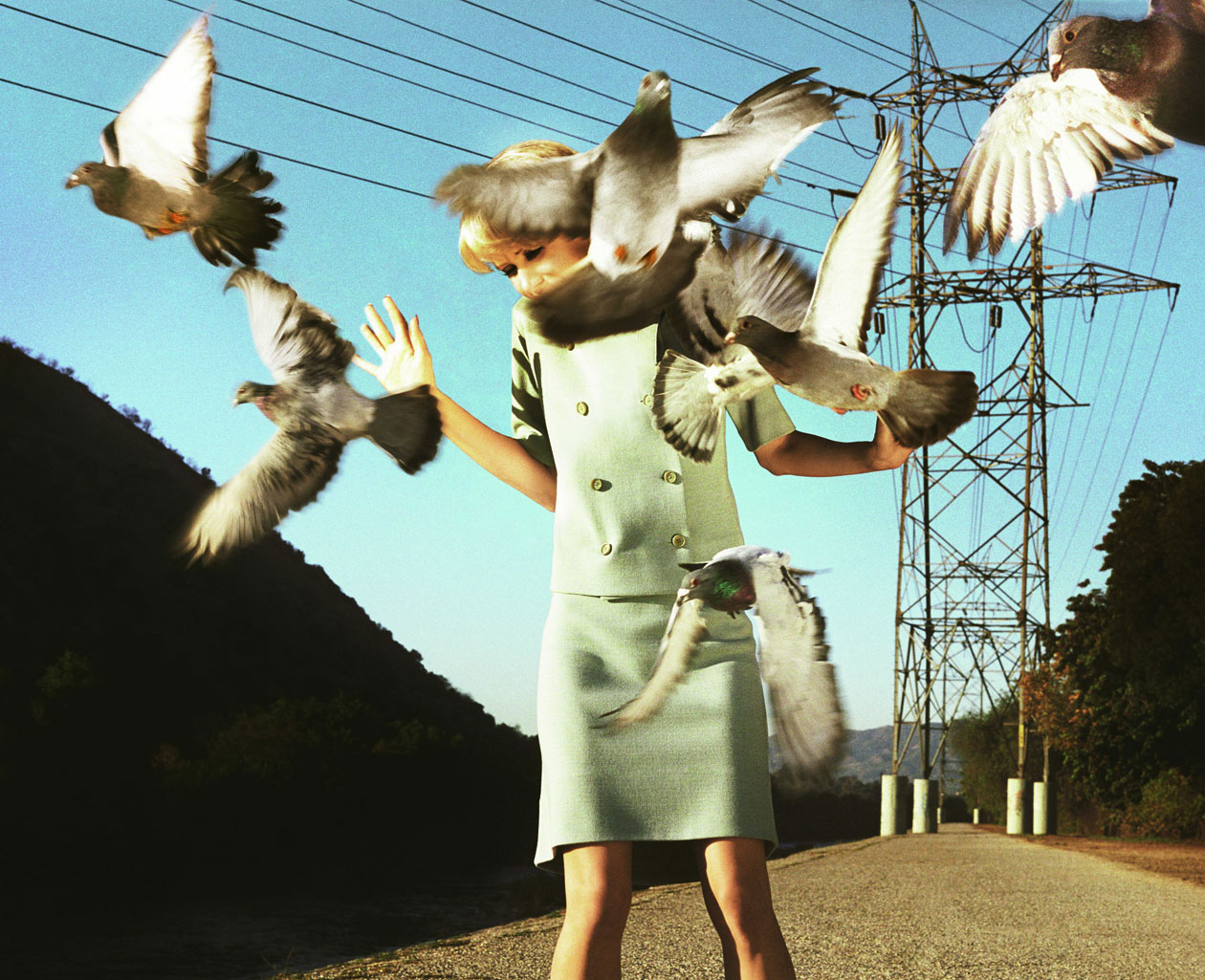
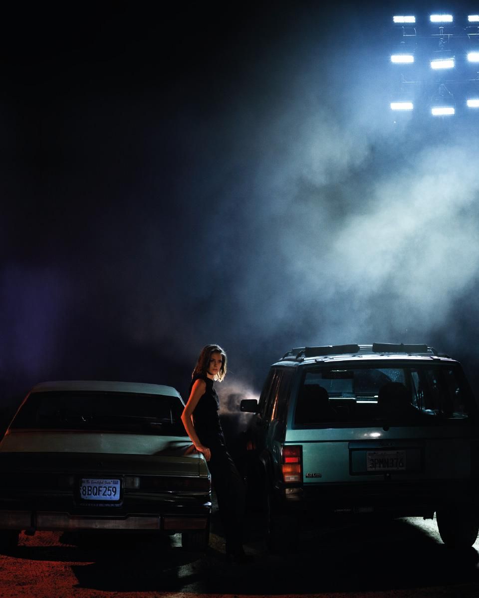
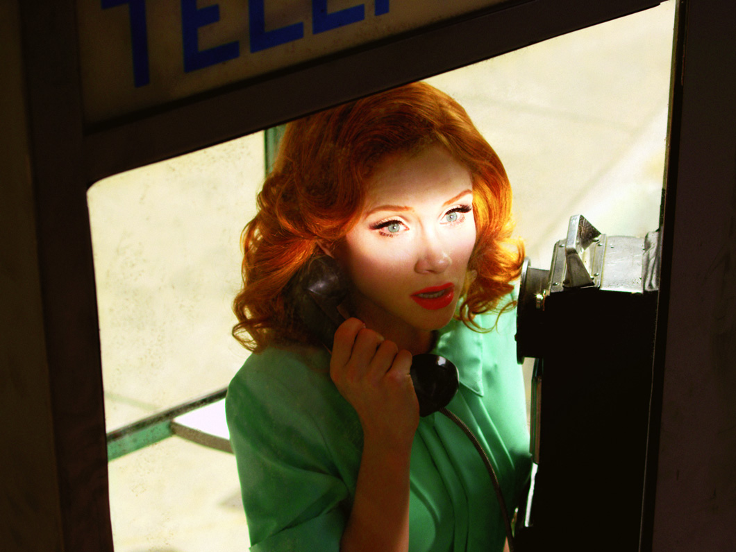
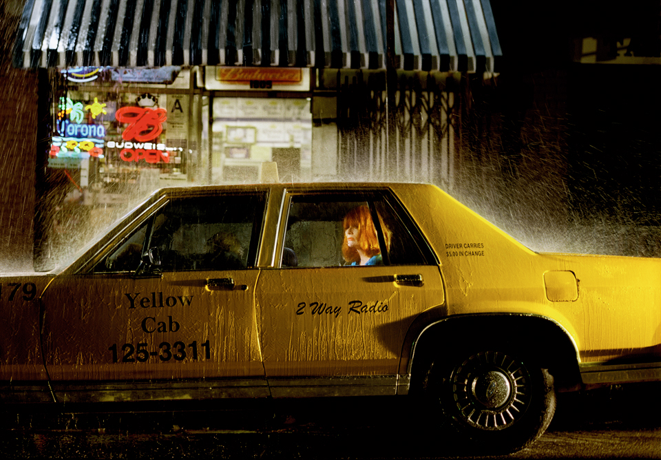
Alex Prager is a photographer and filmmaker who trades in beauty, nostalgia and surrealism.
There's a great deal of storytelling happening in these photos. Beyond just one surreal moment, or some reference to the past, she is setting up some scenes with many things happening at once. A car crash, a dead lover. Almost like a renaissance painting or comic book spread. Everything happening at once. A much bigger story implied by the specifics of this captured moment.
There's a lot of ambiguity here, but there's also implied depth.
Coming from animation or film I think this is a very interesting way to think about storytelling. Can you put enough details in the image to imply a bigger story? Can you tease them? Draw them in with a few threads but not weave the whole thing together? I think this is a powerful idea for film or photography alike.
Battles - The Yabba
Battles Yabba is a strong example of taking a simple theme and extrapolating it to build a much bigger greater idea.
Spike Jonze – Apple Home
I mean what can I say? I've been a fan of Spike Jonze since Mouse days, since Girl and Chocolate. He has made some of the most personally impacting and meaningful work that I have ever seen. And of course, he's still going.
This music video / film / ad is so simple in idea and so amazingly executed. And using props and sets and storytelling to show you, escape. Sanctuary in music. Expansive soundscapes.
It's wonderful. Truly. Bravo.
And a bonus, From Mouse 1996:
Wild Nothing – Album Art Video
Wild Nothing. To Know You / TV Queen
Wild Nothing did an amazing job taking the photography from Life of Pause and creating a video actually living inside the space depicted on the album art. This one is buoyed also by the fact that I love the record and these songs particularly.
Directed by Shawn Brackbill.
Kerala – Bonobo
Bonobo Kerala - Directed by Bison
I love this video. Its so simple in concept but so effective in its storytelling. It's simply hypnotic in a way of only revealing a few more frames at a time with each loop back. Also the subtlety in the visual effects here is impressive. Things are happening, but we are a little unclear exactly what, or how. And with each loop back we are both teased and pulled away from what we just saw and given another chance to watch it through.
Well done, Bison.


