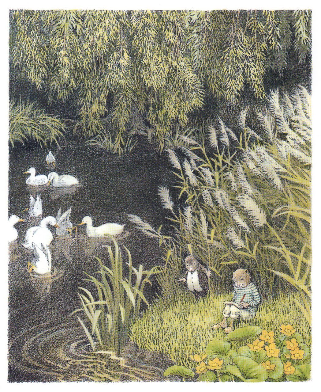
The Wind in the Willows is classic book, with some incredible illustrations in various editions. Wholesome and cozy a delightful for a century.
Wind in the Willows - Inga Moore
Inga Moore — 1999

Inga Moore — 1999
The Wind in the Willows is classic book, with some incredible illustrations in various editions. Wholesome and cozy a delightful for a century.
Considering the viability and ethics of AI in art and technology today. I have plenty more to say, this is just an initial collection of thoughts…

An appreciation of Mike Mignola. Always a pillar of inspiration for character, form and a graphic striking style

Ignasi Monreal is a Spanish illustrator based in Lisbon, who paints some really inventive and fantastical images that incorporate classic themes and mythology with modern fashion and personal observation.
it seems to be he’s thinking through concepts of beauty and absurdity mostly, recalling Hieronymus Bosch (15th century) or finding the divine (perhaps timeless) beauty in some modern person passed out on a couch, or checking her makeup on public transit. These small moments are elevated and shown in a format we associate with classical painting typically reserved for Gods or Cathedrals. And in a way allows us to imagine that maybe Michelangelo, in painting Gods and Angels and epic scenes, was probably also incorporating current things around himself that he found beautiful or sexy. Bringing this very human touch to the divine world.
Gucci Halucination - Production Company: The Line.
Cor Blok is a Dutch illustrator who made some of the earliest visual interpretations of the Hobbit and Lord of the Rings by JRR Tolkien.

I saw a thread recently on Twitter about how bad the covers for the hobbit were from the mid 90s which lead to loads of people posting covers of LOTR and The Hobbit book art. And so I posted my own experience. The books I had read, my moms copies, were far and away some of the nicest of the lot. These felt whimsical and fun very much in line with Tolkien’s original drawing for the Hobbit and Lord of the Rings.
Barbara Remington illustrated them for the 1965 paperback editions, one of the most widely know editions to that time. She designed them all quickly, without having read the books. And I think they are just wonderful.
Though Ms. Remington regretted being unable to read “The Lord of the Rings” and “The Hobbit” before illustrating them, she was ultimately happy with the way her artwork came out.
“After reading his work, I was in awe of Tolkien,” she said. “I knew there was something special about him. If I read ‘The Lord of the Rings’ first, I don’t think I could have drawn the cover art.”
Barbara also moved to New York City in the early 60’s and was active in the Beat Movement of the time. Extended interview with her at Tolkien Collectors Guide.
Tolkien actually didnt much care for Barbaras work, not understanding what some of the animals (whats that, a lion?) and plants (are those… pumpkins?) being depicted were. And thats too bad, but she hadnt read the book, so, get over it I guess. I Love Barbara’s work, just as I love Cor Blok, who’s depictions were also called out by tolkien for not being accurate, though he did like them. People can make up whatever visuals they like that suit them. Its partly an act of creation in reading, imagining the world you hear described.
Coincidentally, the bad cover from the hobbit in the 90’s? That was the art on the version I read then as well.
Barbara Remington Obitutary — New York Times

Barbara Remington illustrated Map of Middle Earth in the same style and with many of the same elements as the 1965 paperback cover.
Michael Herring illustrated 90s covers. The ‘bad’ covers mentioned above. Its too bad, the rendering quality is nice, they just seem a bit hokey compared to the graphic colorful 1965 version or Tolkien’s own drawings which are cute and a bit naive.
Last week I was talking with some friends this week about the release of The Midnight Gospel today on Netflix (from Duncan Trussell, Comic and Psychedelic Wanderer and Pendleton Ward, Creator of Adventure Time) and I wanted to show them this epic little short I found years ago. I struggled to remember the name of this cartoon, googling wildly:
…to no avail But since I did finally find it I’ll share it here.
It’s another cartoon related in tone and content to Adventure Time from Jesse and Justin Moynihan, which is no surprise as Jesse worked as a storyboard artist on Adventure Time.
The writing is silly and broad. It’s awkward bro-speak thats good for a laugh. Almost written as if a child did a take on sci-fi fantasy stuff and just didn’t know about or bother with appropriating the typical science jargon. Its endearing like that. Feels very related to Adventure time though its a little more violent and grown up. A good stoner psychedelic carton
‘Why you being all mystery-ish?’

Alexander Girard - early 1950’s
Alexander Girard was a designer who worked across a wide range of media and disciplines and brought warmth to modern design.
Produced by DressCode
Director Dan Covert
The fact that most people don’t understand what graphic design means… has that helped you?
Yes, ‘cause if you decide to define something for yourself it helps if other people don’t have a definition for it. I understood early on that if I call myself a designer I can do whatever I want.
I can direct a commercials, I can do an animation I can create installations in museums, I can have shows I can do all these things.
For years I’ve held up Ray and Charles Eames for their amazing ability, as Designers, to do whatever is they want. Direct a film? Yes. Design a typeface? yes. A Chair? A house? Yes of course. A pattern, a bicycle? for sure. Anything. Everything.
This guy gets it. This is my goal, my foil against specialization. If it is ideas, creative, aesthetics, storytelling? Yes, in fact, I can.
From Vimeo:
The Windshield Wiper is a very personal and particular vision on Love and relationships.
Written, directed and designed by Alberto Mielgo and Produced by Leo Sanchez Studio and Pinkman.tv. Running time : 15min
Key Frame Animation
albertomielgo.com
leosanchezstudio.com
pinkman.tv
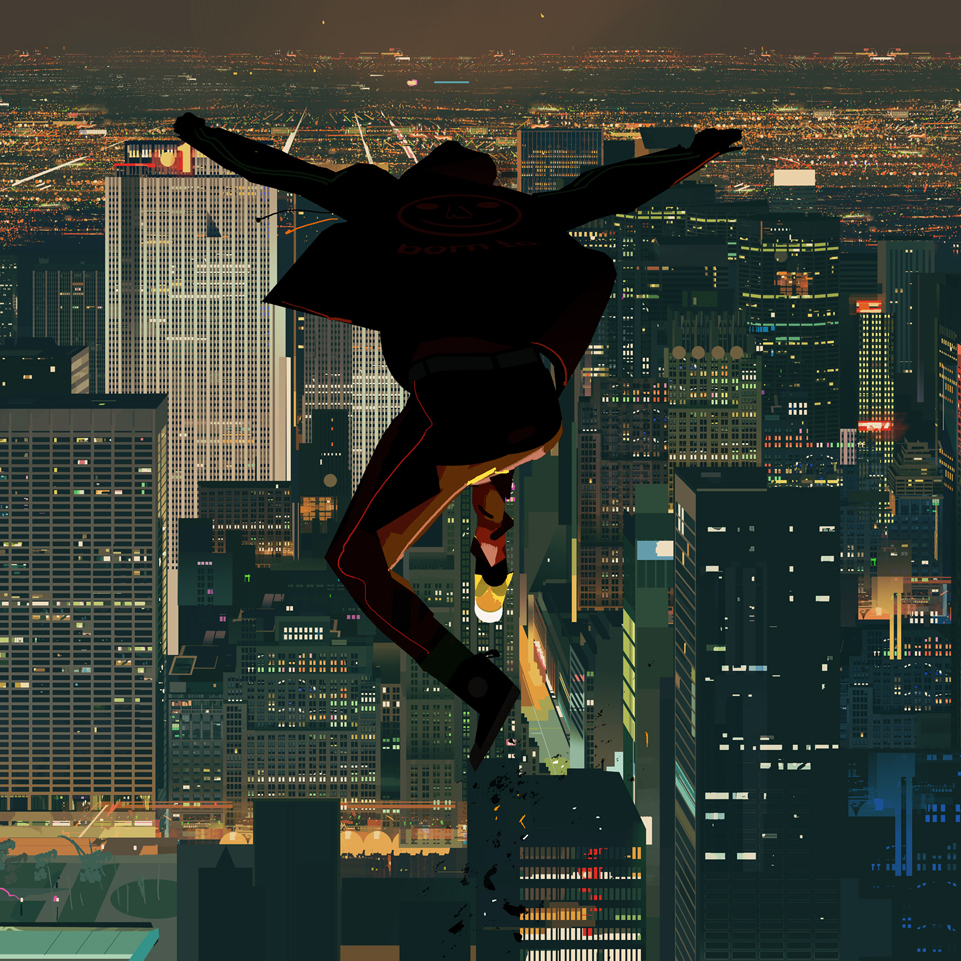
Alberto Mielgo, hot off of both Into The Spiderverse and Love Death & Robots, released this trailer last month for The Windshield Wiper.
It’s amazing to see how even as this work is so hard to pin down exactly how its made, it is expertly translated to animation. It is both technically and an creatively astounding.
Both the digital and physical paintings are wonderful and it was hard to figure how any of them were made when I first came across them. Hard to distinguish digital from real paint. The style and execution is so strong. And digitally, his was one of the first artists I saw working from a pure speed perspective, no tricky brushes, no layers, just paint… Gotta go fast.
With the animation, specifically for The Witness (from Love Death & Robots) they make a point to call out KEY FRAME ANIMATION… because its unclear how this film was made. Is it mocap? Is this rotoscoped over live action? The lighting and render quality bridges this amazing gap of realism and style.
It looks photographic, it looks painted. It looks right.
Previously on Alberto from me.
SpiderVerse Concepts:
Love Death & Robots – The Witness

Esad Ribic is a painter from Croatia.
I've recently read Thor, the Unworthy (Coipel) and Thor God of Thunder, The God Butcher (Ribic) comics and I am blown away by the quality of the art on each page. A lot of this work is comprised of very strong compositions and watercolor, which in many instances show a sort of greyed down, washed out color into the shadows. A suggestion of atmosphere and depth that you seldom see. Comics tend to lean heavily on black, and fill in colors underneath. But these paintings are fading away, into the distance, and yet still remain dynamic and strong. Striking.


Alberto Mieglo. Spanish painter and concept artist. Notable works include visdev for Tron Uprsing and the Beatles Rockband Open (which is how I first found his work). Simply stunning.

Sachin Teng has a striking ability to take these (usually warm) limited palletes, quality draftsmanship and very unique ideas and make them take form. Slicing through figures, symbology, graphic overlays and lush painting all in one place. And he animates as well. Amazing.