A couple of winters ago, my wife and I decided to read Wind in the Willows to each other for a time before bed. I’m not sure why exactly we did. The book had a charm and nostalgia for each of us and we thought it would be fun, and so we read it.
I remember reading the story as a boy, though I didn’t really remember much of the actual details, just that Toad was a handful and the books setting was cute. Reading it was inspiring and endearing. The setting and the characters, the message is just so wholesome. Its almost like reading lord of the rings but dealing only with the shire, only with the hobbits, concerned about having a cozy home, and connecting with friends. The book is wonderful, honestly.
And after having read this, I started looking into the illustrations of the book and there are some really strong entries for various editions. And people take favorites.
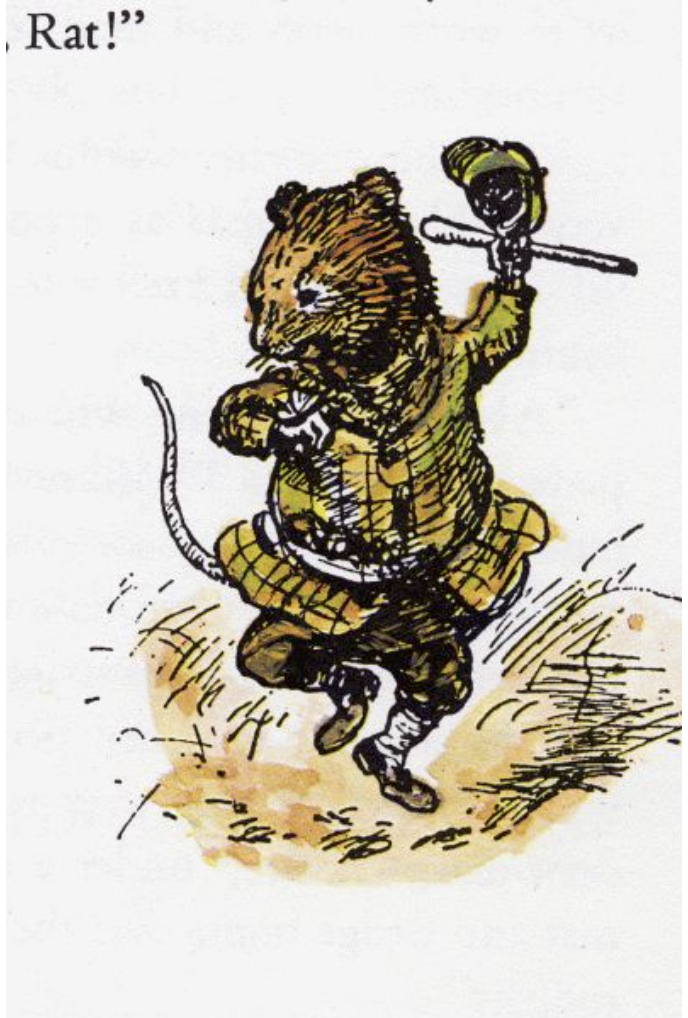
EH Shepard — 1931
Shepard, who is known for illustrating the Winnie the Pooh books, also did Wind and the Willows, And these drawings are wonderful like a haiku, exactly only what marks need to be there to express the scene and the feeling. They do a tremendous job at this. These are the images the are what probably everyone sees then they remember these stories, they are definitive, and so special.
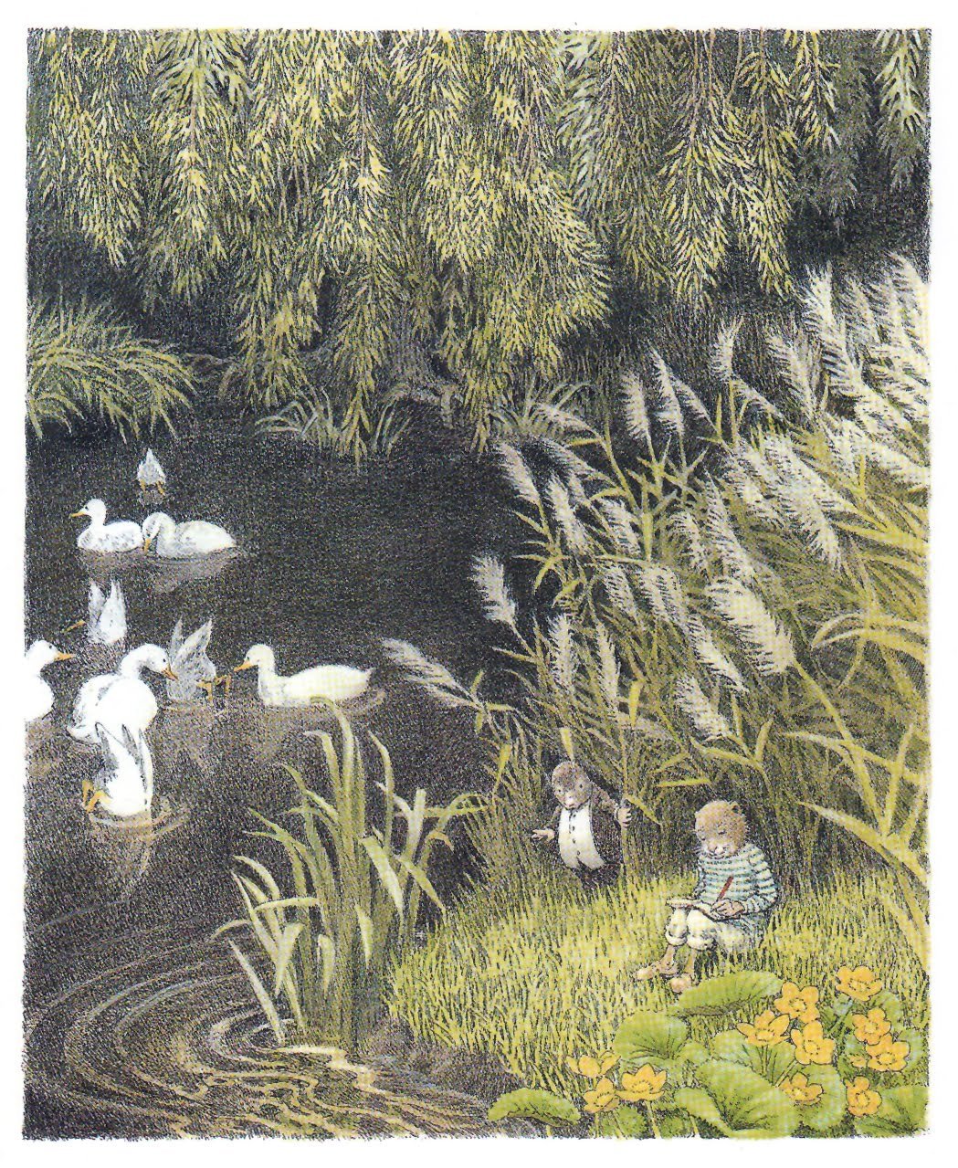
Inga Moore — 1999
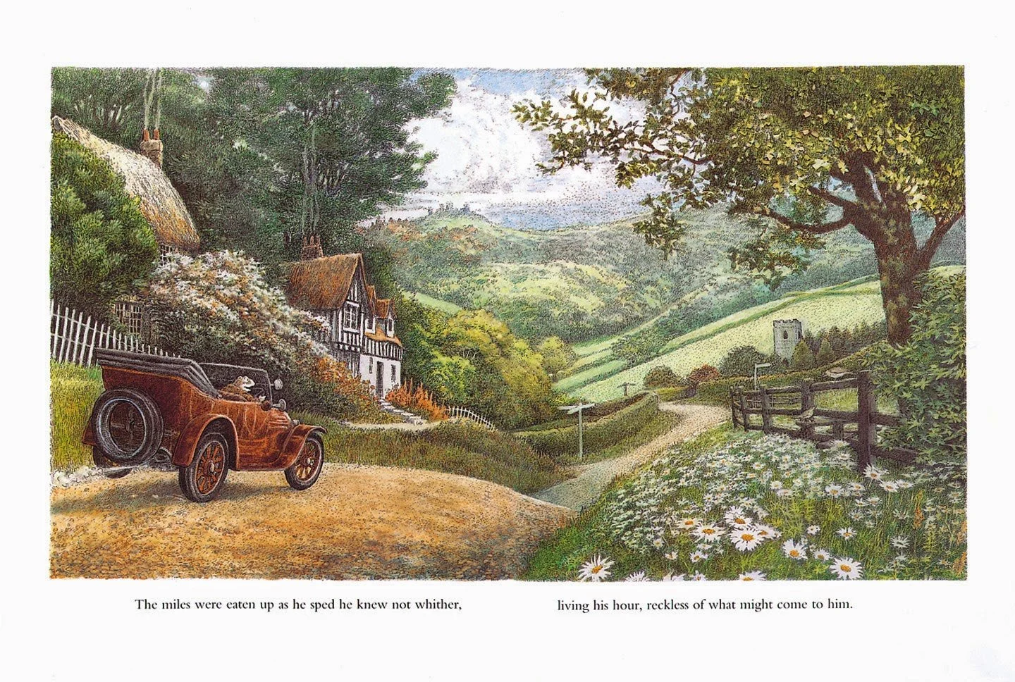
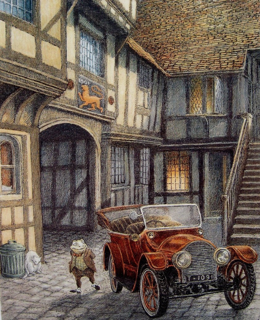
The thing that is so striking to me about Moore’s illustrations is the incredible scale and detail of the environments. They are so lush and beautiful. The world is wide and character feel delicate and small inside it. Truly a woodland creatures eye perspective of the telling of it.
“I'd been in the pub with an old boyfriend and he'd suggested it, quite out of the blue. I was rather shocked. I might have thought about it, but only as an impossible dream. Shepard's are the definitive illustrations.
“I felt I could go a little further than Shepard, and show more of that whole world the characters inhabit.”
—Inga Moore
From this Guardian Article
Understanding Comics
There’s a concept in Understanding Comics (page 42) where Scott McCloud talks about TinTin to illustrate a point about rendering and subjectivity. He explains that when a character is simplified it is easy for the reader to put himself in their place; the put themselves in the story. As opposed to a very detailed character which will appear psychologically to be more objective; we are outside them observing.
But placing a simple character into a very detailed world has a uniquely powerful effect of immersion. The world feels big and real, and we experience the story from within it. Studio Ghibli also does an incredible job with this effect. The characters can be simplified but move with personality, and the world is just overwhelmingly detailed and beautifully painted. Almost every shot of every film.
Inga Moores’ drawings do exactly that, locate the reader in the woods, in the burrow, in toad hall, and do so incredibly well.
