The Bus is a wonderful surreal strip comic by Paul Kirchner.
Washed Out – Floating By
This video uses a fun collection of repeating animated clips, from 2D or taken from I bet keys off a greenscreen to tell us a story about daily life and the repetition therein.
-
Directed by Drew Tyndell for Washed Out
Also, watch down the Mister Mellow Show here for an awkward time via Stones Throw.
Manly – Jesse & Justin Moynihan
Last week I was talking with some friends this week about the release of The Midnight Gospel today on Netflix (from Duncan Trussell, Comic and Psychedelic Wanderer and Pendleton Ward, Creator of Adventure Time) and I wanted to show them this epic little short I found years ago. I struggled to remember the name of this cartoon, googling wildly:
PSYCHEDELIC CARTOON SHAPES PYRAMID LAZER VIOLENCE FIGHT TESSERACT
…to no avail But since I did finally find it I’ll share it here.
It’s another cartoon related in tone and content to Adventure Time from Jesse and Justin Moynihan, which is no surprise as Jesse worked as a storyboard artist on Adventure Time.
The writing is silly and broad. It’s awkward bro-speak thats good for a laugh. Almost written as if a child did a take on sci-fi fantasy stuff and just didn’t know about or bother with appropriating the typical science jargon. Its endearing like that. Feels very related to Adventure time though its a little more violent and grown up. A good stoner psychedelic carton
‘Why you being all mystery-ish?’
George Condo on Drawing
George Condo is an American painter and artist. He lives in New York.
He talks about Picasso and early 20th century artists rebelling against his classical training… for Condo painting in the 80’s it was all about rebelling against abstraction. Back to figurative image making.
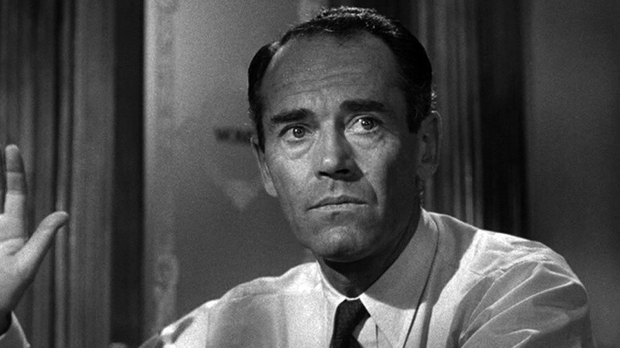
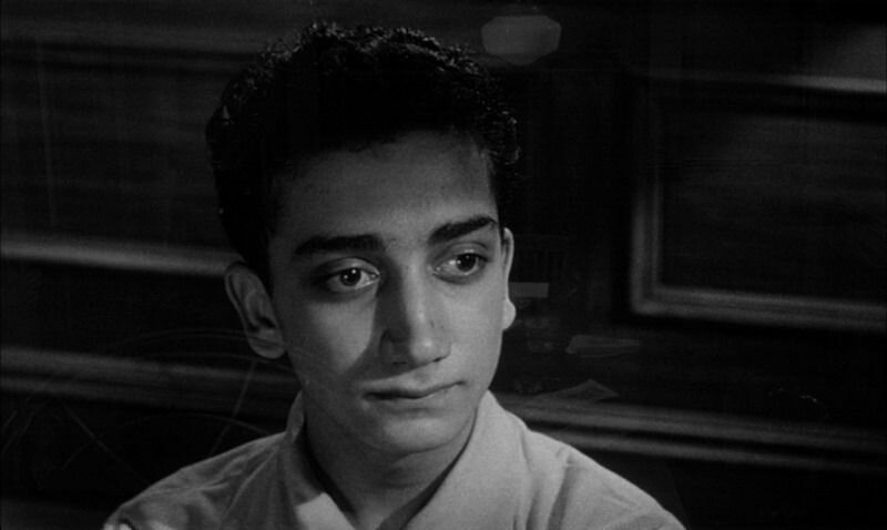
Lumet – 12 Angry Men
12 Angry Men – 1957 Sidney Lumet
Angry, yes I suppose. And also very sweaty.
It’s amazing that this whole film is just one room and so engaging. Shooting dialogue for 90 minutes, and varying angle and light and distance for tone all worked so well.
It’s incredibly well shot actually. I thought at first that the close ups on the dissenter (Juror 8) were a lot like romantic portrait lighting, with a soft irised-down keylight and that this was supposed to be meaningful, for only him. But other characters each later get this treatment as well. That’s just how they liked to light the close ups I guess.
I was expecting, in part from this light, that there would be a turn where it was revealed he had some malicious intention, like a Keyser Söze moment. Or maybe he were somehow friends with the accused or from the same slum or was somehow otherwise meddling with the trial. I was suspicious for a good portion of this film. There is also an early shot after he reveals he has doubts, in which there is a strange turn in the music from happy and chirpy to a sinister final few bars as we dolly in on him. I thought they were showing their cards here.
'I know their type, he’s one of them’
I thought the point of the story might be to show how easily people can be swayed for good or ill, persuaded by someone’s slick talking. Especially in our current age of subjective truth and a misinformed public and the propaganda machine which is Fox News and AM Radio that is constantly working to undermine the idea of truth.
But the story is rather about first how people can be persuaded sure (maybe I was half right), but also how even when things seem clear cut, with deeper examination they may not be. And that our personal internal prejudices do more to affect our opinions than we realize. Lumet himself explains it that the dissenter is the hero, he is the voice of reason. This I missed until much later when it becomes obvious that the hard guilty plea people have deeper prejudices.
The story is also about race and class prejudice which makes sense for the time it were made. The assumptions you make of your neighbors who are different ‘those people’ ... ‘they don’t value human life like we do’. And sadly, these prejudices still haunt us, even if their forms may have altered slightly. We are still dealing with these misconceptions of our neighbors in America, right now.
Another very interesting technical detail on display here is the staging and camera morphing across the whole picture. That as the characters and story have arcs they follow, so too does the camera. In his book, Making Movies, Lumet describes this at play in several pictures. Using aesthetic elements to convey meaning over the course of the film.
THE LENS PLOT – From Making Movies - Chapter Five, The Camera
It never occurred to me the shooting an entire picture in one room would be a problem. In fact I felt I could turn it into an advantage. One of the most important dramatic elements for me was the sense of entrapment those men must have felt in that room. Immediately a 'lens-plot' occurred to me. As the picture unfolded, I wanted the room to seem smaller and smaller. That meant that I would slowly shift to longer lenses as the picture continued. Starting with a normal range (28mm-40mm) we progressed to 50mm, 75mm and 100mm lenses.
In addition, I shot the first third of the movie above eye level. And then, by lowering the camera, shot the second third at eye level and the last third below eye level. In that way, by the end, the ceiling began to appear. Not only were the walls closing in, the ceiling was as well. The sense of increasing claustrophobia did a lot to raise the tension of the last part of the movie.
On the final shot, an exterior that showed the jurors leaving the courtroom, I used a wide angle lens. Wider than any that had been used in the entire picture. I also raised the camera to the highest above eye-level-position. The intention was to literally give us all air, to let us finally breathe, after two increasingly confined hours.
This is a very simple idea to execute across the film and it’s affect might be hard to detect viewing casually. But surely you can feel it. This decision adds to the overall feeling in the film in ways that the acting should, the light should… but here the camera too is used to make you feel the story. It’s so smart.
His book is one of the best I’ve ever read on the technical and creative process of making a film and the decisions that go into directing. I strongly recommend it anyone interested in movies.
Fellini – 8 1/2
Tap Dancing away from your bullshit
I'd been meaning to watch this one for years because I'd read it’s a great example of surrealism in film and blending fantasy and memory into objective reality. This movie happens to be even a bit more relatable and cutting as it is by a creative person about their creative struggles. I always find this really nice and reassuring that even these huge directors, who's success hinges on their ability to HAVE A VISION and pull that vision together with a team, still struggle with not having answers. or not feeling relevant.
I watched a short interview with Terry Gilliam on the disc talking about the film and he calls out the shot of Guido walking down the hallway in the hotel where various cast and crew are popping out of their rooms needing answers how to execute their jobs. And Guido has no answers... and by the end is literally dancing away from them. Avoiding the responsibility. It’s a really beautiful visual pun illustrating the feeling or issue.
...clearly Fellini was working on a movie, he didn't know how to finish it, it wasn't coming together, and so he wrote a movie about making a movie, about a director who doesn't know how to make or finish his movie.
And funnily Fellini actually tells it a different way, where it was during the production of this same film, a film he intended to be about a creative person (maybe a writer?) who suffers a creative block that he lost his way after the DP was hired, sets built and booked... he visited the set and felt ashamed the he had lost the idea, he had no vision... and in that feeling he found the film.
The crisis came to a head in April when, sitting in his Cinecittà office, he began a letter to Rizzoli confessing he had "lost his film" and had to abandon the project. Interrupted by the chief machinist requesting he celebrate the launch of 8 1⁄2, Fellini put aside the letter and went on the set. Raising a toast to the crew, he "felt overwhelmed by shame… I was in a no exit situation. I was a director who wanted to make a film he no longer remembers. And lo and behold, at that very moment everything fell into place. I got straight to the heart of the film. I would narrate everything that had been happening to me. I would make a film telling the story of a director who no longer knows what film he wanted to make".[11]
This is the kind of like, Oscar-bait navel gazing films about films we are all pretty used to seeing in the last 20 years, and that can be a little annoying at times. but I really appreciated this one. Making work is hard, being creative is hard. Leading a team is hard. Collaborating is hard. I appreciate this candor.
AND ALSO somehow about 1:45:00 into the film I thought it just seemed impossibly long. Like is this movie going end? or naw...
And it was very Interesting to see things Tarantino ripped in their original context (the dancing midfilm for Pulp Fiction, the Mia Wallace styling) and what feels like circus music (by Nino Rota) that Danny Elfman must have been aware of when he wrote the theme from Pee Wee's big adventure. It feels also related to Synecdoche New York another meta film which is surreal and funny, but also incredibly brutal.
++++
Anyway, Fellini kills, very fun. Very Style. I give it Eight (e mezzo) Parmesan Wheels.
Walk Like You - Alexander Girard
Alexander Girard was a designer who worked across a wide range of media and disciplines and brought warmth to modern design.
Rutger Bregmen — On Taxes
Dutch historian and author Rutger Bregmen, gave a speech to attendees at Davos earlier this year, calling out the strange hypocrisy of the ultra-wealthy talking about their philanthropy and spending toward the ‘common good’ and in a systen where many of the problems the developed nations face are due to money being pulled out of the system by theses same People. Using tax-avoidance schemes, the rich effectively crippled the infrastructure and social safety nets designed to help society at large; a completely common practice for most corporations and the wealthy. They then spend their riches on philanthropic endeavors like museums etc… which are nice, sure. But funding the opera is maybe not as valuable as a strong free health-care system or robust infrastructure and mass transit to most people.
You can find his book, Utopia for Realists on this subject.
Yaniv Fridman, Creative Director in Mexico City, animated a short section of this speech.
Anand Giridharadas is another writer who has been speaking a lot on the same topic and has a book out discussing the issue, Winners Take All: The elite charade of changing the world. This is on the list to read, and every interview Ive seen with him is very fun and enlightening. He puts the blame squarely on tax avoidance as well for many of the worlds current problems.
Walk Like You – Geoff McFettridge
Produced by DressCode
Director Dan Covert
The fact that most people don’t understand what graphic design means… has that helped you?
Yes, ‘cause if you decide to define something for yourself it helps if other people don’t have a definition for it. I understood early on that if I call myself a designer I can do whatever I want.
I can direct a commercials, I can do an animation I can create installations in museums, I can have shows I can do all these things.
For years I’ve held up Ray and Charles Eames for their amazing ability, as Designers, to do whatever is they want. Direct a film? Yes. Design a typeface? yes. A Chair? A house? Yes of course. A pattern, a bicycle? for sure. Anything. Everything.
This guy gets it. This is my goal, my foil against specialization. If it is ideas, creative, aesthetics, storytelling? Yes, in fact, I can.
The Windshield Wiper
From Vimeo:
The Windshield Wiper is a very personal and particular vision on Love and relationships.
Written, directed and designed by Alberto Mielgo and Produced by Leo Sanchez Studio and Pinkman.tv. Running time : 15min
Key Frame Animation
albertomielgo.com
leosanchezstudio.com
pinkman.tv
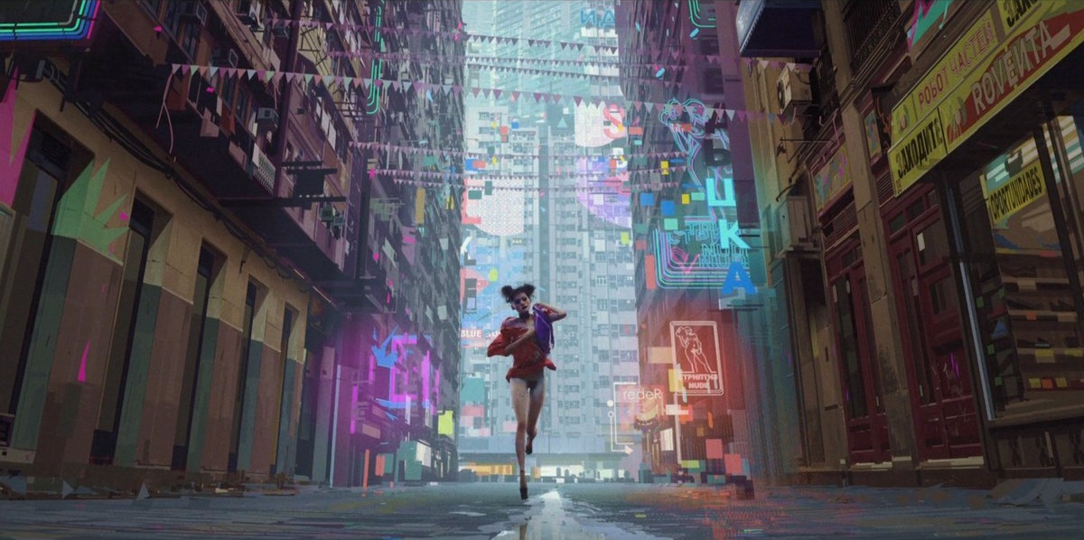
Alberto Mielgo, hot off of both Into The Spiderverse and Love Death & Robots, released this trailer last month for The Windshield Wiper.
It’s amazing to see how even as this work is so hard to pin down exactly how its made, it is expertly translated to animation. It is both technically and an creatively astounding.
Both the digital and physical paintings are wonderful and it was hard to figure how any of them were made when I first came across them. Hard to distinguish digital from real paint. The style and execution is so strong. And digitally, his was one of the first artists I saw working from a pure speed perspective, no tricky brushes, no layers, just paint… Gotta go fast.
With the animation, specifically for The Witness (from Love Death & Robots) they make a point to call out KEY FRAME ANIMATION… because its unclear how this film was made. Is it mocap? Is this rotoscoped over live action? The lighting and render quality bridges this amazing gap of realism and style.
It looks photographic, it looks painted. It looks right.
Previously on Alberto from me.
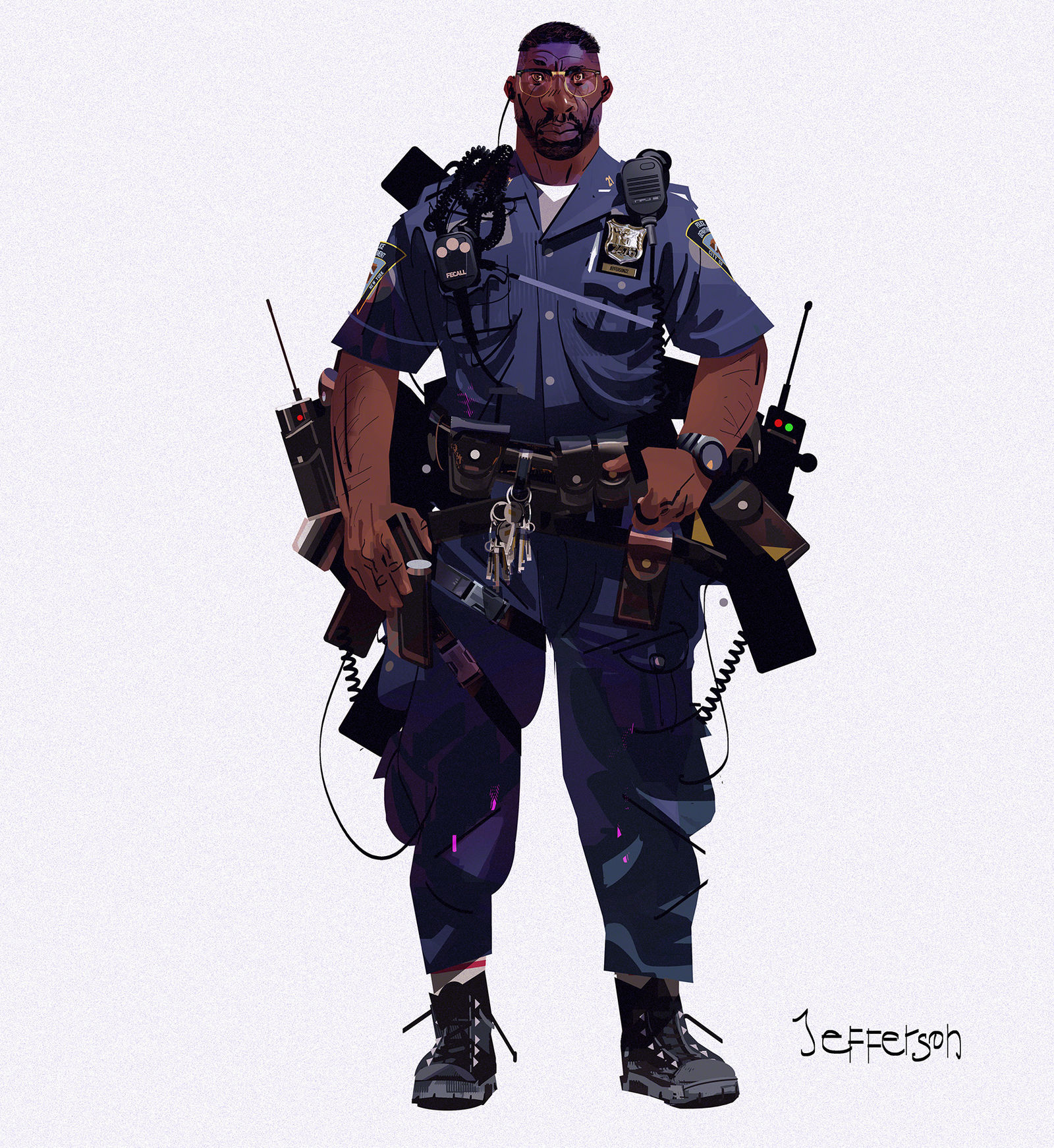
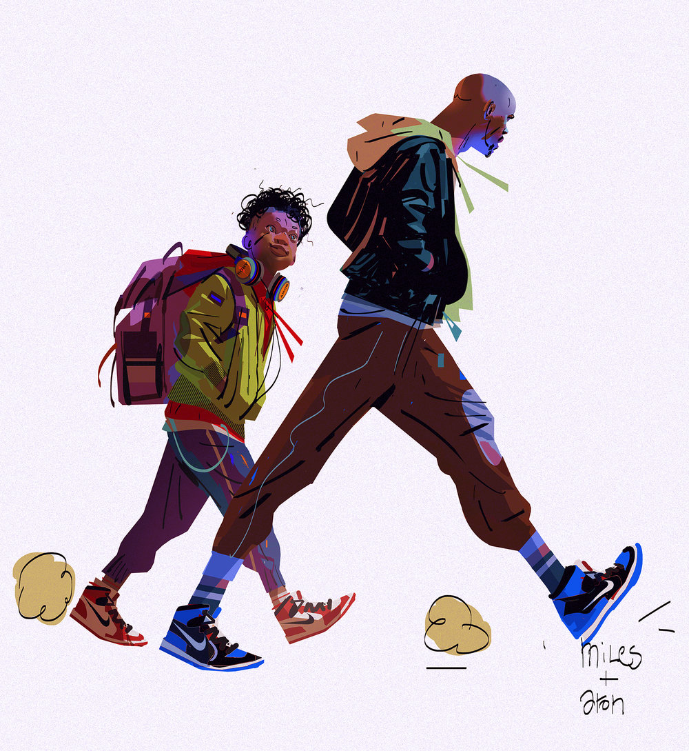
SpiderVerse Concepts:
Love Death & Robots – The Witness
Walk Like You – Helena Almeida
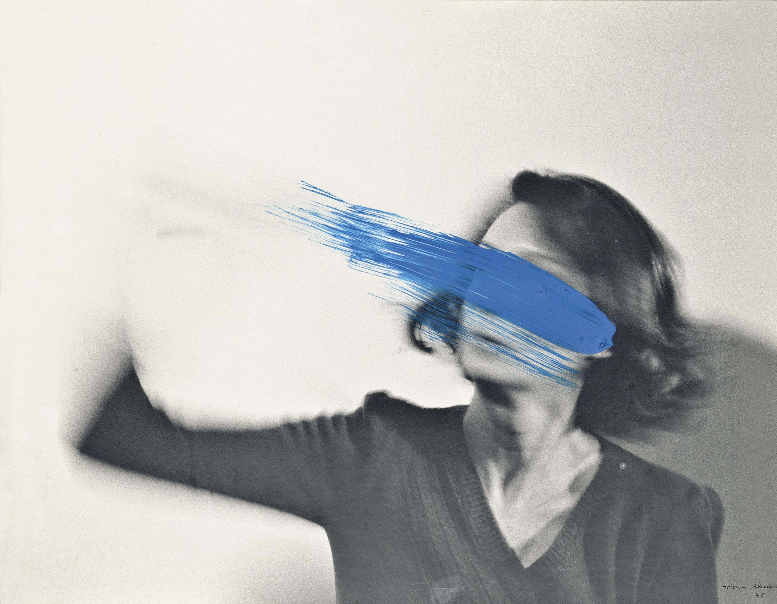
Helen Almeida is a Portuguese artist and photographer who was active creating surreal photography and collage from the 1967 on into the 80's.
Her work plays with the line between the art and the viewer, breaking the forth wall, acknowledging the medium. Playing with expectations. It also makes the artist herself, the subject of the work. Another boundary to play against.
There is no difference between the work and artist's body. In her work, a woman's image is always present, but the image is transformed in a painting or drawing. Almeida avoided creating self-portraits. Rather, "My work is my body, my body is my work." "I am the canvas."[5] Her work has been described as "halfway between a performance (capturing an instant), and body art (the body itself as the absolute protagonist).[6]
More:
Walk Like You – Marilyn Minter
Marilyn Minter
Last year I had the opportunity to see PRETTY/DIRTY at the Brooklyn Museum I had gone to the museum for something else entirely, but wandered into this show and it floored me. These large scale images eight feet, ten feet across. Paintings on Aluminum panel, photoreal based on amazingly lush and layered photographs. Video of high heeled feet smashing glass ornaments, water, paint and pearls.
There’s a lot to go into the sex positive feminism of these works, or the combining of dirty rough grit with beauty, and what beauty actually is. What our relationships are to our own sexuality the artifice of makeup and dress. I honestly should have to read more interviews and more from the artist directly but for now suffice it to say that these works are technically impressive and undeniably powerful.
Walk Like You – Yuri Schwedoff
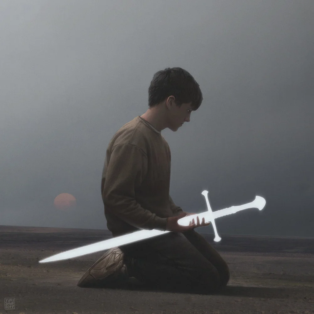
Yuri Schwedoff is a Russian artist and painter. These works seem to mostly be digital, but they are rendered with a high degree of realism. They are dark and atmospheric. Fantastical stuff. Very fun.
I don’t know where or if photography plays into his workflow, but it seems like it must, at least as reference for faces, poses etc. Or maybe he is just that skilled at knowing how light plays on things. I know for me personally, if I’m drawing from a live model or a photograph, there are always details and features that show up that I would totally miss if I am drawing purely from my mind. Things from my head look cartoony and odd. Its not the same. But certainly with practice you can develop a knowledge of anatomy and color and light that gets you to realistically imagine most anything.
Lusine – Just A Cloud
Director - Michael Reisinger | polyc.tv DP - Jeremy M Lundborg Custom LED Lighting System - Alex Borton AD - Sierra Swan Sound - Phil Ryan Makeup & Styling - Katherine Dawson
This video for Just a Cloud by Lusine, like I’m fond of saying, succeeds as a simple premise well executed. It shows transcendence through a solitary moment, losing oneself as you might do with sensory deprivation or psychedelics…
There are obvious allusions to 2001 and the portal, a cinematic reference that you see over and over again because its so powerful and so well done. I’ve even tried to reference it, its such a huge landmark in effects an storytelilng and cinema.
Reisinger says he wanted to explore the idea of somebody waking up to the realization that we live in a simulated universe…
"In a lot of fictional examples, a character awakens from a simulated world and into the real world, where everything is the same. Color, light, matter—all behave the same as in the simulation. I wanted to put our character through a similar awakening, but into a reality that's overwhelming and incomprehensible. It's the same idea Arthur C. Clarke expressed about advanced civilizations appearing magical to us. If there is a higher reality, experiencing it for the first time would probably be completely disorienting."
I’m not sure I got that message, or if thats what I would have thought without reading that that was the case from the people behind it. I saw it more as an inward journey. The expansion of the of the self, of the mind. But that was just my take. This was a very well done exploration either way though.
There a lot more extended coverage here from Creators Project.


